|
As I've written elsewhere in this account, I had help and inspiration from many sources for this project. I thought it appropriate to print a sort of colophon on the inside of the back cover to acknowledge those who helped me most.
I also wanted to explain at least a little about how I made these. At a glance, some people (non-printers) might not understand how different these are from most of the printed things they see. That said, I'm fully prepared for the inevitable "Hey dude, thanks for the stickers" response from some of the people who get them. That's okay though, because I did this project to force me to learn lots of new things and not in the expectation that everyone will appreciate them for what they are and everything that went into them. |
|
|
|
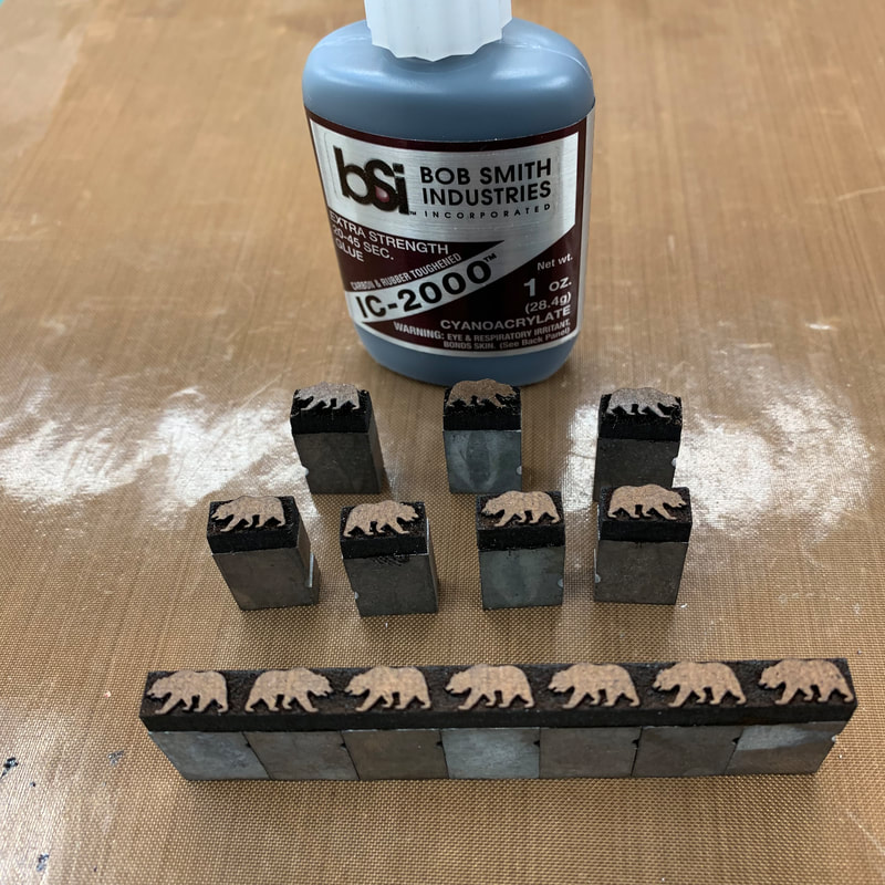
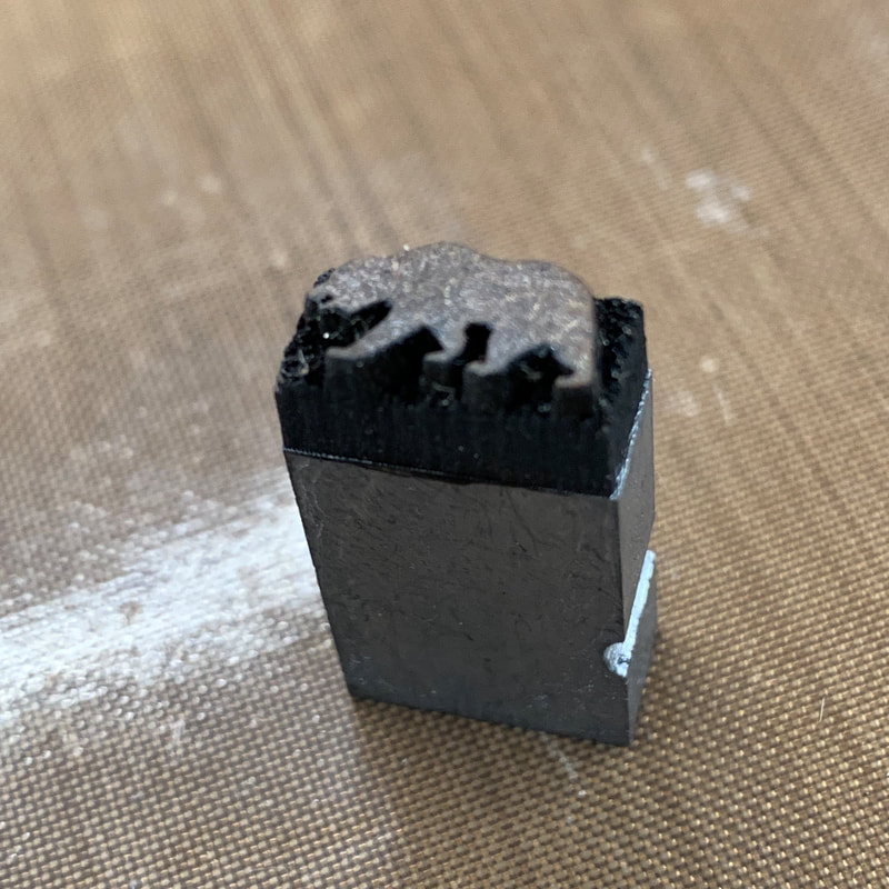
The bears in the Wicked Bear Press logo are laser cut from Masonite (hardboard), one of my first forays into using the laser to make type.
The engraved Masonite is just glued to the top of 18x36 quads that are milled down to bring the printing surface to type high. These print fine, but the details are fragile. This observation was what first led me to think about using acrylic for type. |
|
I'm embarrassed to say that I don't have a single picture of the insanely fiddly form full of tiny 8pt and even tinier 6pt Bernhard Gothic Light. This is one of my favorite sans serif typefaces and we're lucky to have it in a number of sizes.
|
  No letterpress proof yet, so this digital version will have to do.
|

|
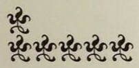
English Monotype 221
|
The wee 8pt ornaments are English Monotype series 221, courtesy of the collection of Pat Reagh of Patrick Reagh Printers. Pat's is the easiest foundry to order from in the USA. His type is available on eBay. You know you need some DingPats. Really, you do.
|
|
For my first go at hand-setting type this small I'm glad that I only had to set a few words in 6pt.
Setting this form called for the nerdiest head gear ever: an OptiVISOR. |
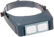
Image from Amazon.com
|

|
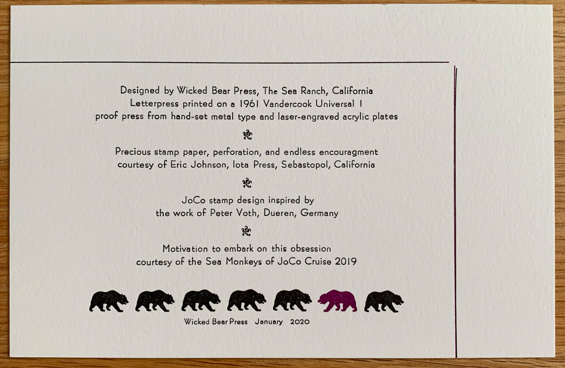
Other than the tiny type, making the back cover was pretty much the same as the front cover, including the need to rebuild the form to run that one wicked bear in purple.
|
Now that the covers were complete, I could make the last component of the booklets: a glassine interleave sheet.
