|
Sheet of Stamps (aka Local Post, Cinderellas, Poster Stamps, Fauxstage) Gummed paper Southern Inks: L.P Dense Black, Purple, Mixing White Letterpress printed, mechanically and laser perforated 6 1/2" x 4 1/2" (165mm x 114mm) |
|
|
These stamps were made during a Partners In Print workshop with Jessica Spring of Springtide Press.
The workshop focused on small scale and perhaps daredevil typesetting for fauxstage stamps. |
|

|
The workshop has 12 participants, and each will create a sheet of fauxstage stamps using sheets pre-perforated by Jessica. Everyone will present their work during the second on-line session and then send sheets to Jessica for inclusion in sets that will be distributed to all participants.
This is the first time I've done an exchange like this, not that it's making me nervous. Honest.
This is the first time I've done an exchange like this, not that it's making me nervous. Honest.
|
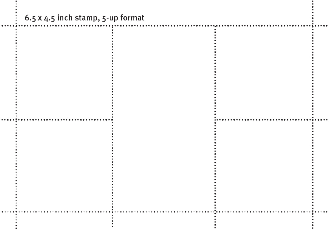
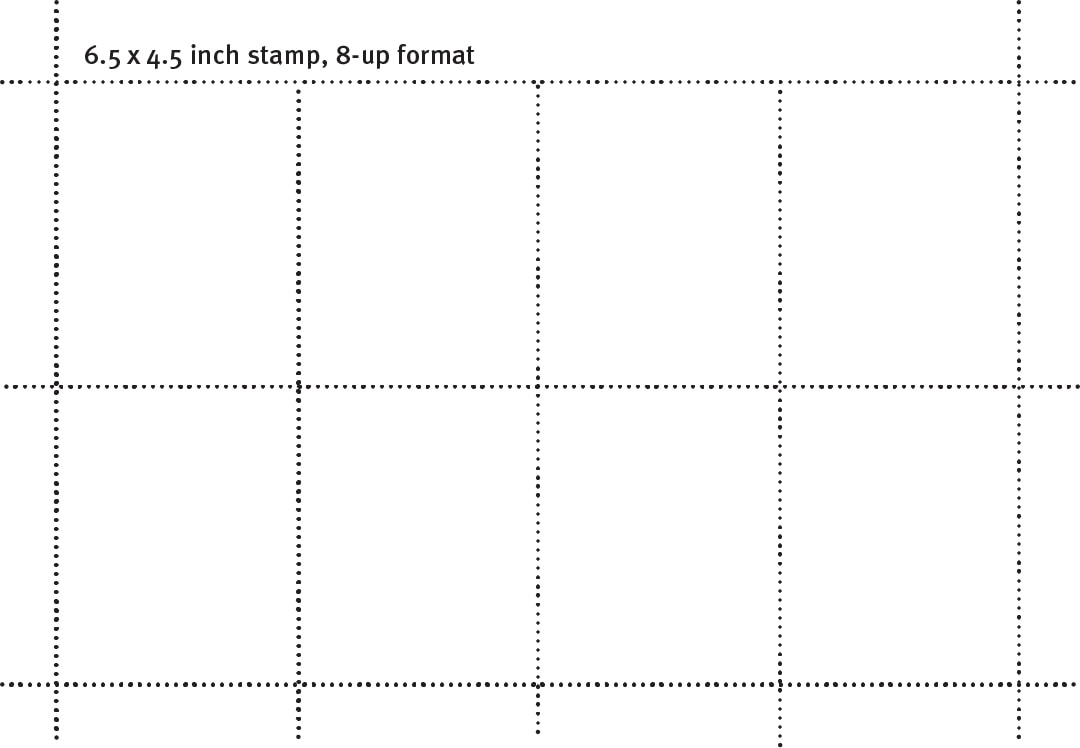
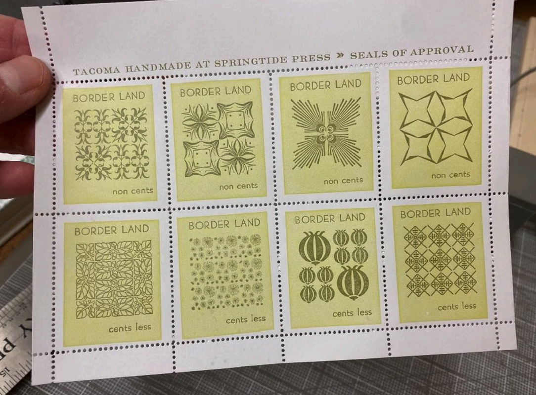
Participants were offered a choice of two sheet layouts: 8 identical stamps or 5 stamps with two sizes.
I chose the 5 stamp sheet because each stamp was larger than those on the 8 stamp sheet. |
|
|
Jessica related a story about an early interaction with Anna Banana, one of the Grande Dames of the mail art and artistamp world. That's where Jessica learned that one's artistamps should(?) display both an issuing entity of some sort, as well as a denominated value.
|
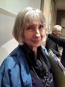
Anna Banana
|
|
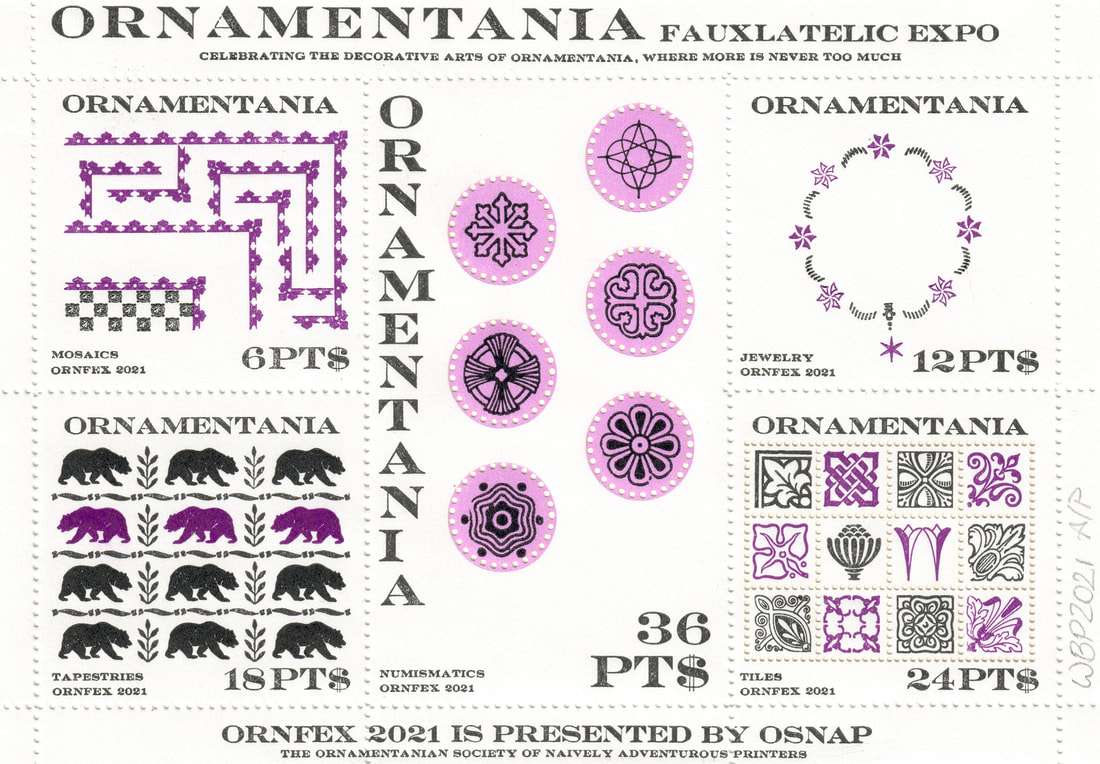
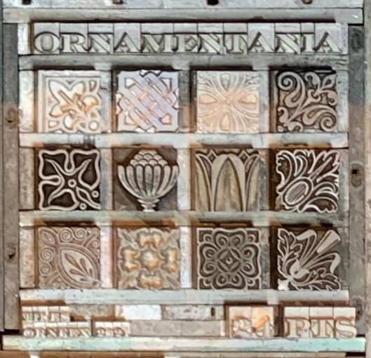
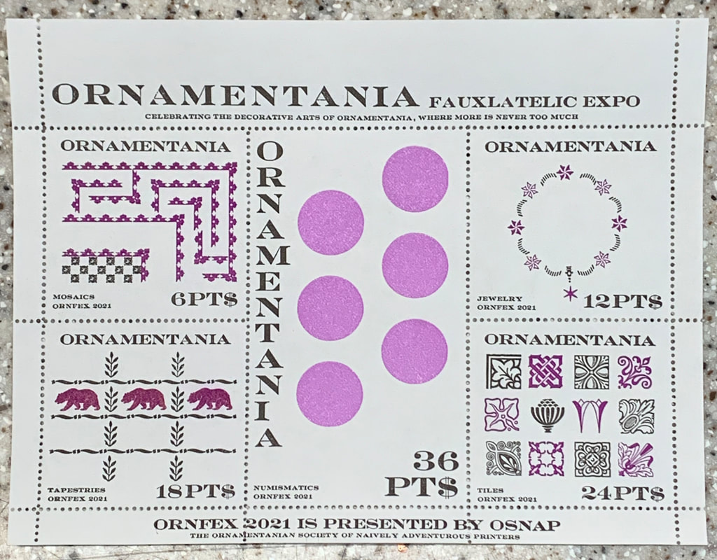
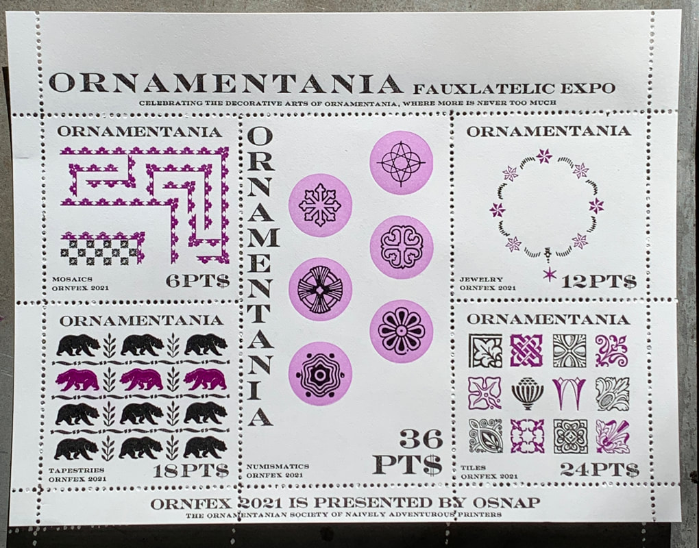
For an issuing entity, I started with Jessica's fauxstage sample from Borderland and jumped off to Ornamentania, a place that is all about the decorative arts and the more decorated, the better. Designs for Ornamentania could appropriately be based on whatever crazy ornamental typography I could actually pull off.
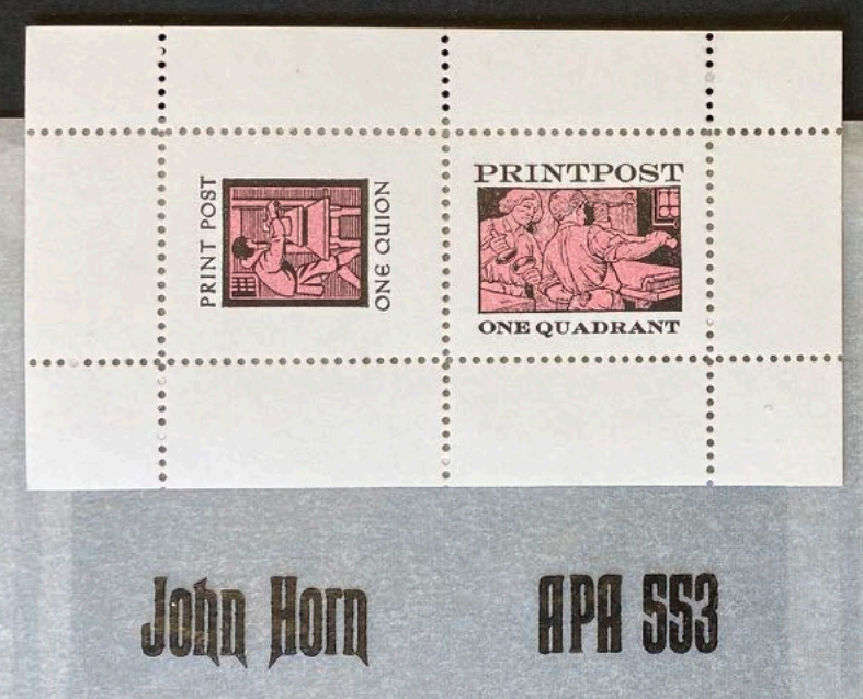
For a currency, I started from an example of the fauxstage work of John Horn of Shooting Star Press. There, he used various printing terms as denominations. That inspired me to use points as a currency. This also made sense because there are many real world examples of things called points that have some value. Points was abbreviated to PTS, which subsequently became PT$ to emphasize the monetary aspect of the abbreviation. Once these ideas came together, it was a simple decision to create 5 different designs, each denominated in PT$ corresponding to a size of ornaments in the Wicked Bear Press type collection. Another design constraint was that all ornaments used in a given design had to have at least one dimension the same as the denomination. Given the sheet layout and size, it was obvious that the overall design should be of a souvenir sheet from a stamp exhibition. |
|
Maybe put in some backstory about Ornamentania here? I guess that would require making some up.
And poke some fun at the philatelist's love of souvenir sheets for stamp shows? Later.
And poke some fun at the philatelist's love of souvenir sheets for stamp shows? Later.
|
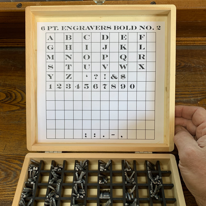
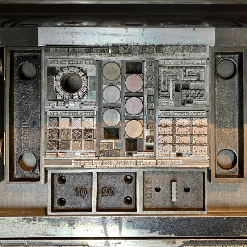
Since that which does not kill us makes us stronger, I decided to hand set much of the text in 6 pt type. That way I could set a reasonable number of characters in the small space of each stamp.
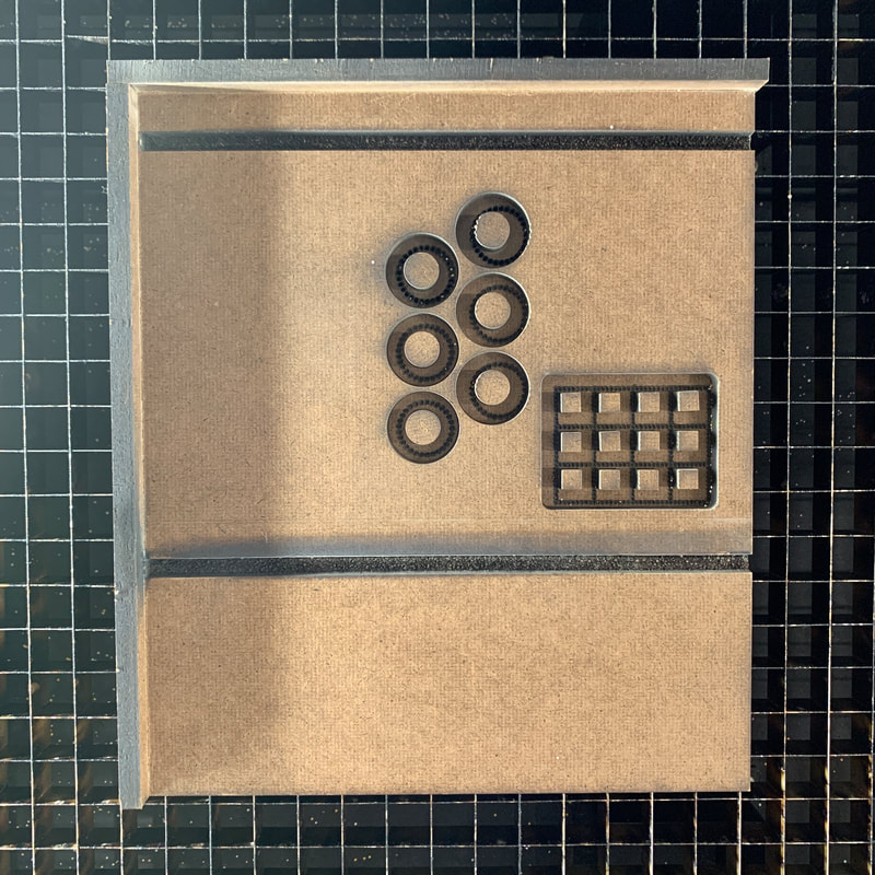
Engravers Bold is a good typeface for connecting fauxstage designs to classic postage stamp designs printed from engraved steel dies. While plenty small, this isn't even the smallest 6 pt Engravers Bold. The No. 1 is even smaller, more like 4 pt characters. A 10X loupe was required to check this as I set it. Even with the loupe, it would have been pretty difficult to set the tiny type without it being well organized in this storage box. The storage box is home brewed from an inexpensive wood box from Michaels and laser cut tempered Masonite dividers. |
|
|
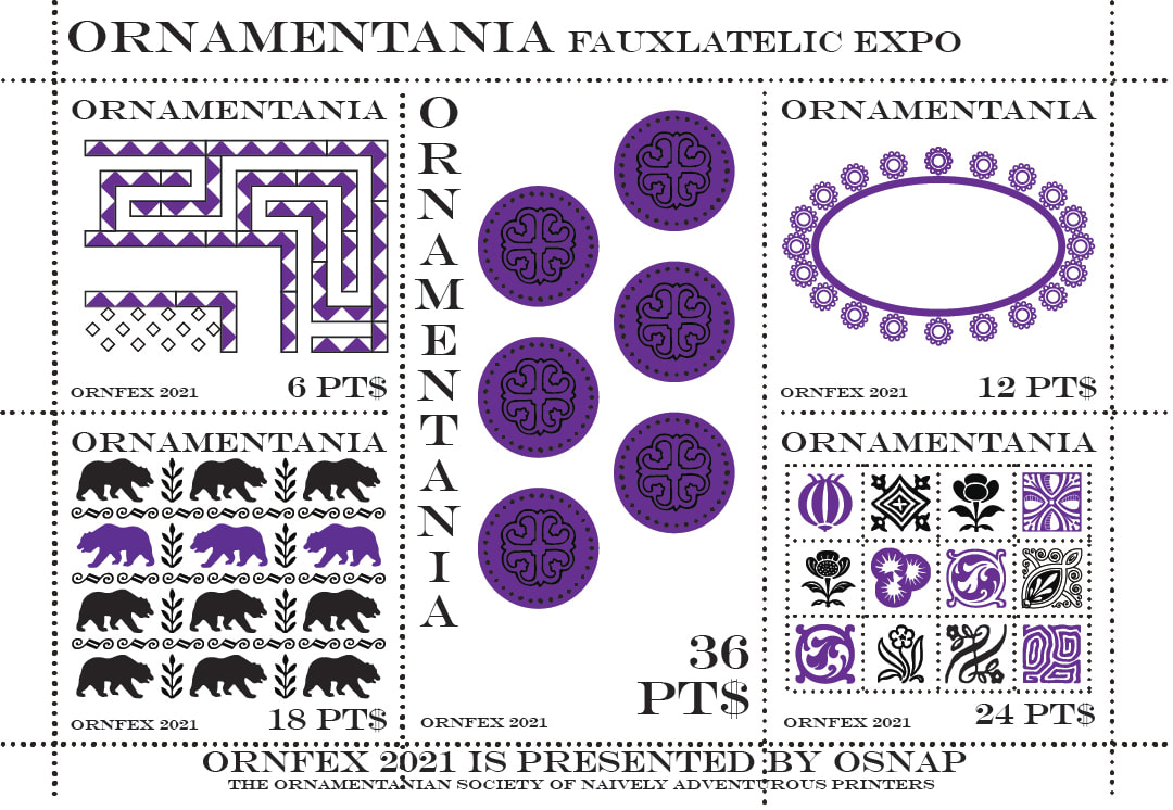
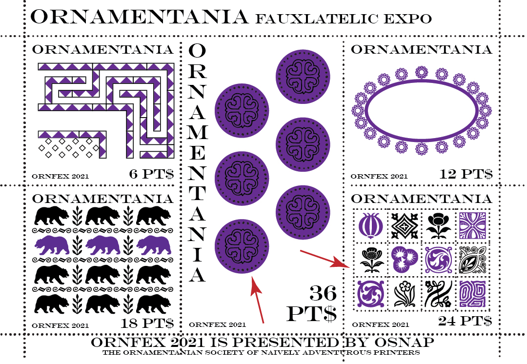
Digital layout of the project using the AI layout tool, which contains hundreds of digitized Monotype ornaments. A very useful tool to help the design-challenged overcome the terror inspired by a blank page.
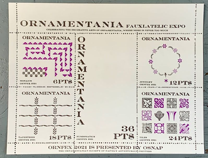
With the exception of the upper right design becoming circular rather than oval, the final design came out pretty close to this. |
|
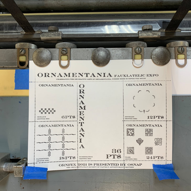
A view of the nearly final form.
Note the top line of text up against the head end of the bed with no leading. I had to do this because I used every point of the space Jessica gave us at the top margin. This left me with no room to put in Rouse register quoins at the top just in case I needed to tweak the position of the form as it was rebuilt between press runs. Turned out to be okay, though because after the first black run, all the text at the top came out and I was able to add the register quoins as part of the spacing. Next time it would be nice to have a bigger sheet. Next time it would also be nice to notice that something bad happened at the top of the form at some point during the run and the long line of 6 pt text went wobbly. |
|
|
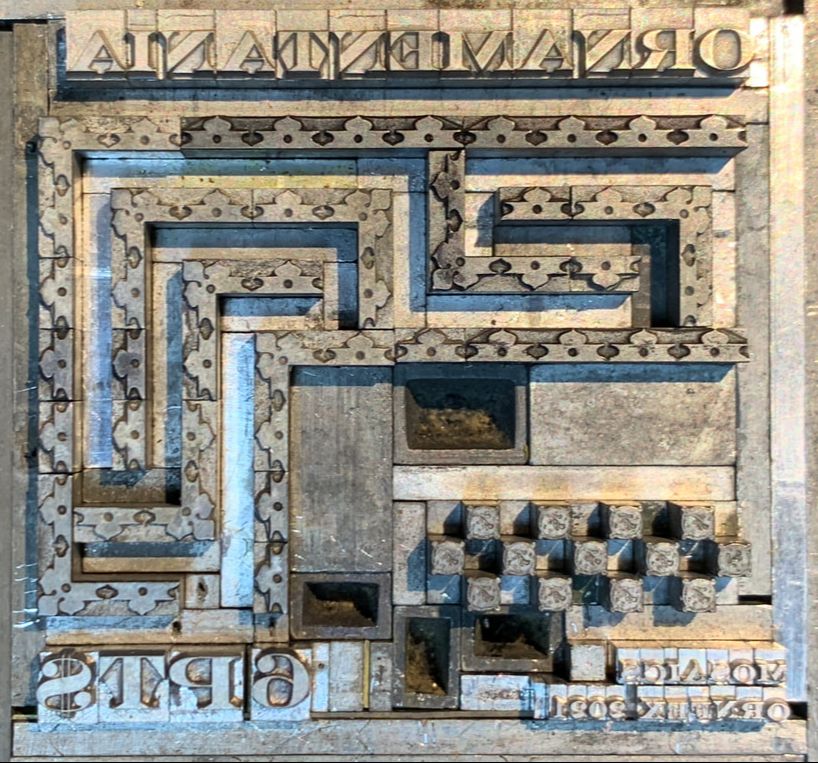
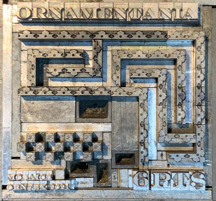
The nearly final 6 PT$ form for Mosaics.
Making the meander would have been a lot easier if I'd chosen something less directional, but I wanted to use 6 pt ornaments with cast corners from our collection. In hindsight, these ornaments didn't really make a good meander. Something more like tesserae would have worked better. This design was inspired by my longtime love of ancient mosaics. |
|
|
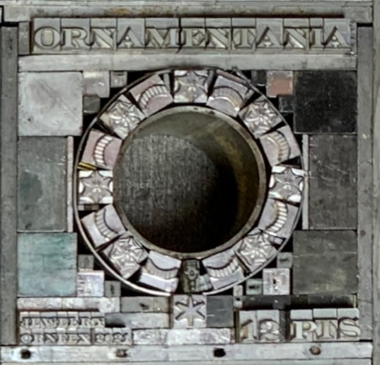
The nearly final form for 12 PT$ Jewelry.
My first ever attempt at daredevil typesetting. Not for the faint of heart. The form is embarrassingly loose in real life. Glad to be printing it on a Vandercook. Even so, it moved around during the run. This design is a nod to my ongoing enthusiasm for metalsmithing and jewelrymaking. Plenty about that elsewhere on this project site. |
|
|
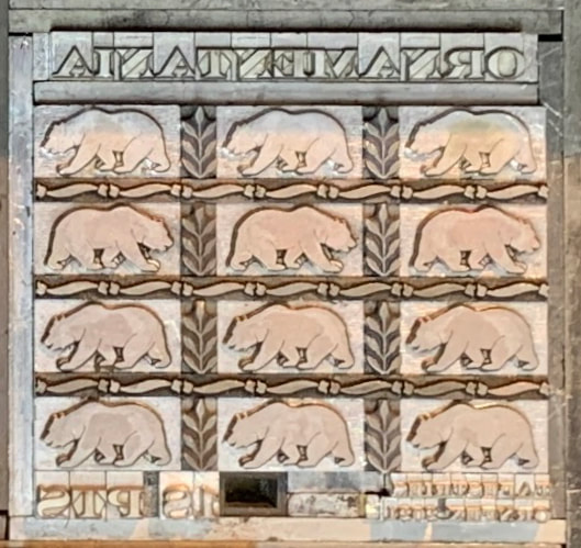
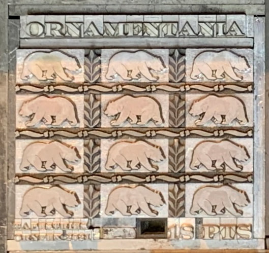
The nearly final form for 18 PT$ Tapestries.
This design is a riff on the Wicked Bear Press logo and The Sea Ranch where we live. The plants and wavy bits symbolize the redwood forest and the ocean, respectively. I cast the bears myself in Pat Reagh's foundry from custom mats engraved by Ed Rayher. 
|
|
|
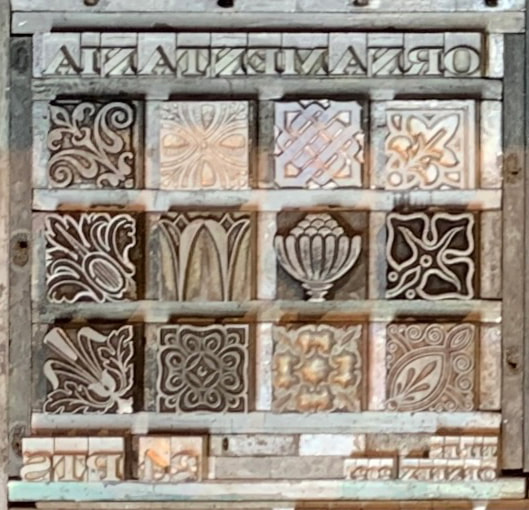
The nearly final form for 24 PT$ Tiles.
I originally tried to set this with circular quads but there wasn't enough room to do so at 24pt. This design comes from a previous obsession with medieval handmade tiles and their Victorian progeny. Too bad we moved away from the house where most of the tiles I made were laid. Then again, The Sea Ranch has its compensating attributes (see above). |
|
|
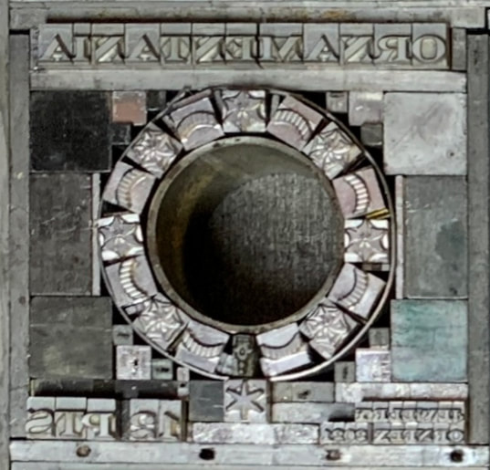
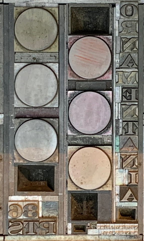
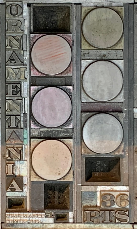
The nearly final form for 36 PT$ Numismatics.
Cheated here in that the tint blocks are 48pt circles while the black over-printed designs are 36pt. Setting vertical text turned out to be a lot more time consuming than I expected because each character had to be justified to the 24 pt width of the widest character (cap M). At least that made it easy to swap out for a piece of 2 pica furniture. This design came from noodling on what I could make using tint blocks and wanting to do some circular laser perfing in this project. And who doesn't like shiny coins? |
|
|
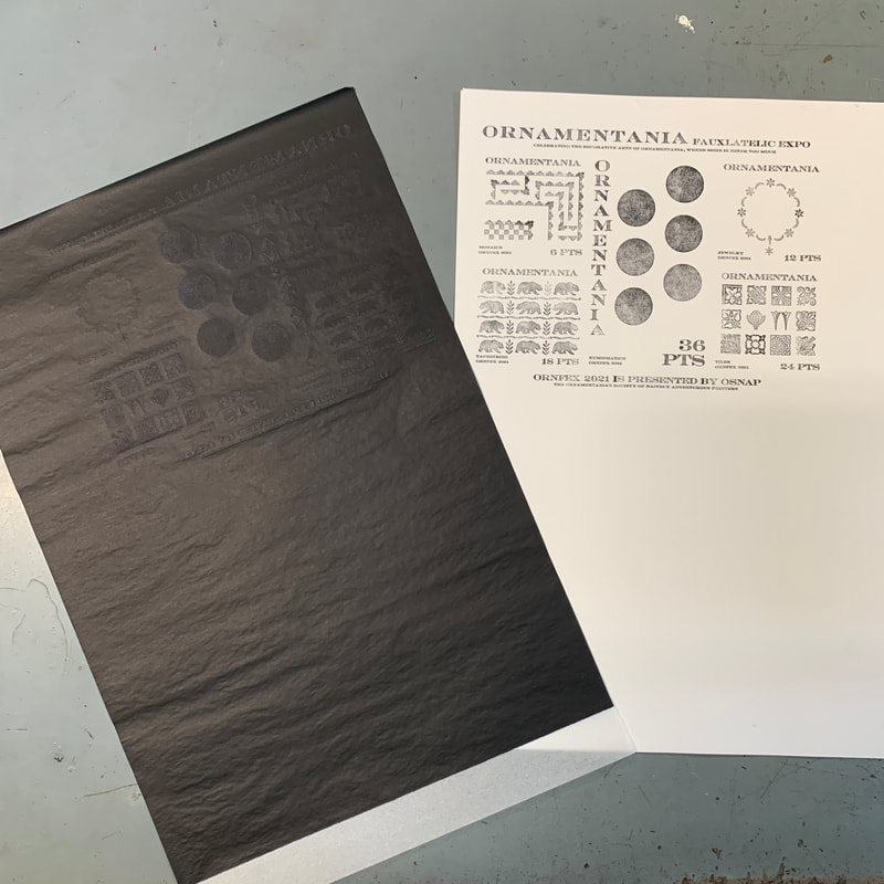
Carbon paper proof of the nearly final form.
Many thanks to Jennifer Farrell of Starshaped Press for introducing me to this method of getting a decent enough proof to evaluate the overall design and check for typos. |
|
First print run, the black text and smaller ornaments.
Larger black solids (bears) printed in a separate run so the tiny details on the text and small ornaments don't fill in with ink. (Another tip from Jennifer Farrell of Starshaped Press.) Note the blue tape tabs at the foot of the sheet. The automatic sheet delivery tapes on the Vandercook were causing the trailing edge of the sheet to buckle and hang up on the form so I started taping the sheet down. This is only an issue on these little sheets. A normal letter sized sheet doesn't exhibit this severely enough to be a problem. I didn't notice how cockeyed the line of 6 pt text beneath the title became when I rebuilt the form for the black text. |
|
|
Second print run, purple small ornaments.
As with the black, the purple bears will be run separately. Removing the black text and smaller ornaments took an absurdly long time because I tried to take them out as intact small forms. That way if something unfortunate happened I could run the black again. |
|
Third print run, solid purple bears.
Even with the press inked up pretty heavily I had to add a bit of impression to get good, solid bears. |
|
|
For the purple tint blocks on the coin stamp, I needed a much lighter purple so the black overprinting would show up well.
Since I didn't need any particular value, just one that was light enough, I mixed the ink on the press. I inked up the press with mixing/transparent white and then dotted on a bit of purple with a popsicle stick. The first try was right where I wanted it. Bright, solid, not pastel, and the black should show up just fine. |
|
Fourth print run, purple tint blocks (discs?) for the coins.
Stopping the carriage to tape down the trailing edge of the sheet left a witness mark across the solids from where the form roller stopped on the form. This mark was visible in the printed solid circles. I had to tape down the sheet, return the carriage to the feed board, run the carriage down on trip to even out the ink, and then print. Extra time, but with the powered carriage not a big deal. I could have lifted the form rollers when I was taping down the sheet but just running the carriage down seemed easier to keep straight. |
|
|
Fifth print run, solid black bears and black overprints for the coins.
That's the printing complete. The registration on the coins isn't uniformly great, but neither was the work of the mint in Ornamentania on which these designs were based! Now for some supplementary perforating. |
|
The keen eyed observer will have seen some extra perforations in the digital layout way back at the beginning.
Since the laser can make any path into perforations it would work well to set off the round coin designs. And rows of tiny perfs in between the tiles emphasize that they are different objects and simulate the grout lines in tile pavements. More than you might ever want to know about using the laser to perforate fauxstage can be found here.
|
|
|
|
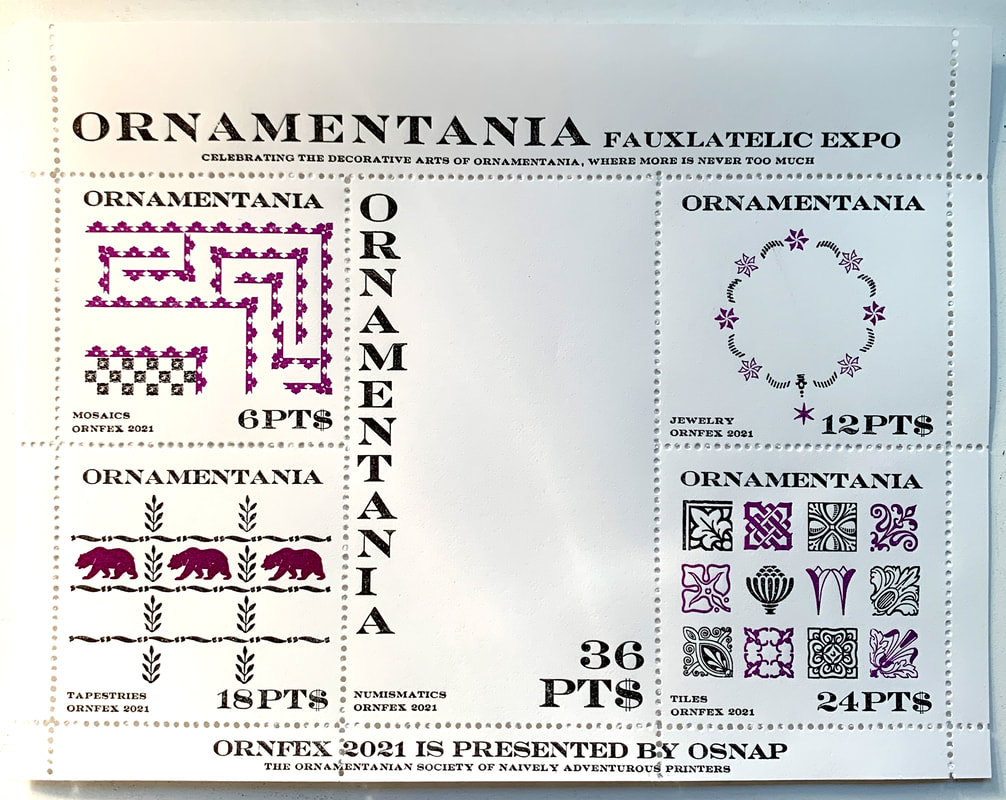
The finished project.
The perfs registered with the coins better than I had hoped and showed that with effort the Vandercook can do repeatable work. The perfs in the tiles showed that I didn't work hard enough to get the black and purple tile runs in registration. It was hard to see as I was printing because there aren't edges on each design to line up. But, just as all the stuff going on made it hard to see the mis-registration when printing, it also camouflages the mis-registration of the perfs. More decoration is always better. This is Ornamentania! |
