A goal for this project was to learn to make printing plates from laser engraved acrylic (Plexiglass, Perspex).
I wanted to see how much detail I could achieve with the laser engraving. It wouldn't approach the level of detail in classic postage stamps since they were intaglio printed from engraved metal plates. But, I hoped I could make plates containing fine features in a reasonable overall size.
I wanted to see how much detail I could achieve with the laser engraving. It wouldn't approach the level of detail in classic postage stamps since they were intaglio printed from engraved metal plates. But, I hoped I could make plates containing fine features in a reasonable overall size.
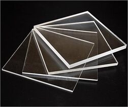
Image courtesy of Tap Plastics
|
My material of choice was 3/8" thick (about 9.5mm) cast acrylic sheet.
From previous experience engraving acrylic, I thought 3/8" thick sheets would survive a pretty deep engraving without distorting from the heat or stresses relieved by engraving only one side. Uncolored, clear acrylic is the least expensive option, but it's still around $15 a square foot. I buy all my acrylic from Tap Plastics. |
|
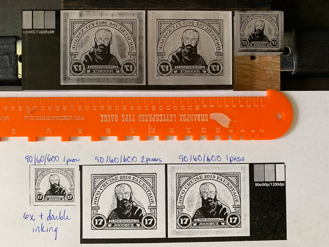
Material in hand, I started on what turned out to be a very large number of engraving tests.
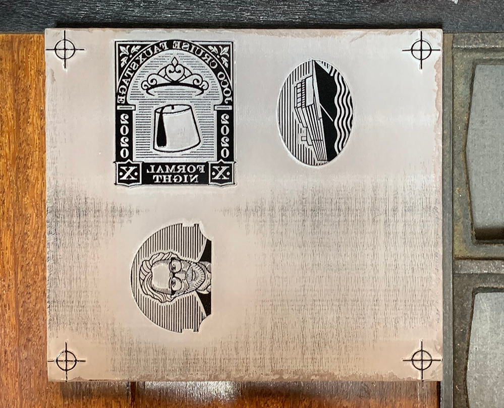
The first test (before I'd completed any of my designs) was based on Peter Voth's St. Maximillian Kolbe stamp. As an aside, if you don't know the St. Kolbe story, take a few minutes to read about it here. It might do something to help restore your faith in humanity despite what we see going on around us today. The test started as a simple live trace of the bit map image. Then I replaced some of the design elements in Illustrator to explore how text would engrave. I meant no disrespect to St. Kolbe by leaving his portrait in while I changed things around it. |
|
|
|
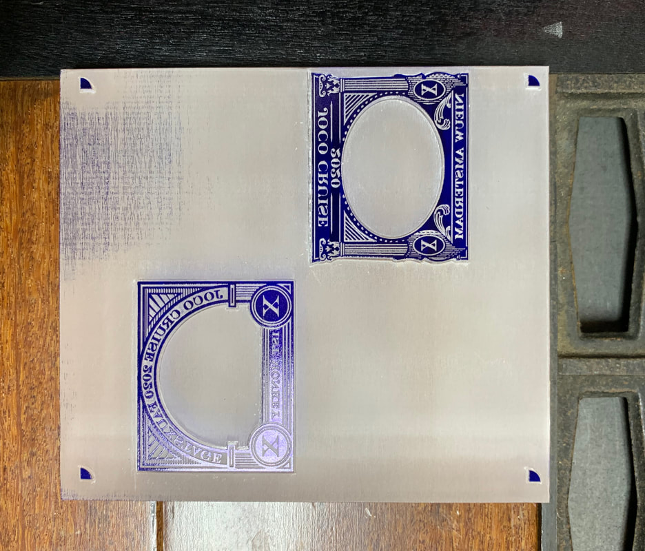
I made and proofed a LOT of plates trying to improve the designs and optimize the engraving process.
|
|
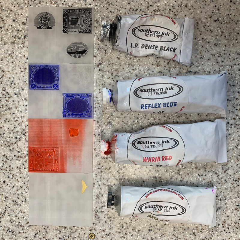
Eventually, the designs and the engraving process were far enough along to take a stab at the color separation plates: black, blue, red, and gold.
The depth of relief in these early plates was not enough to prevent the background from inking and printing. |
|
|
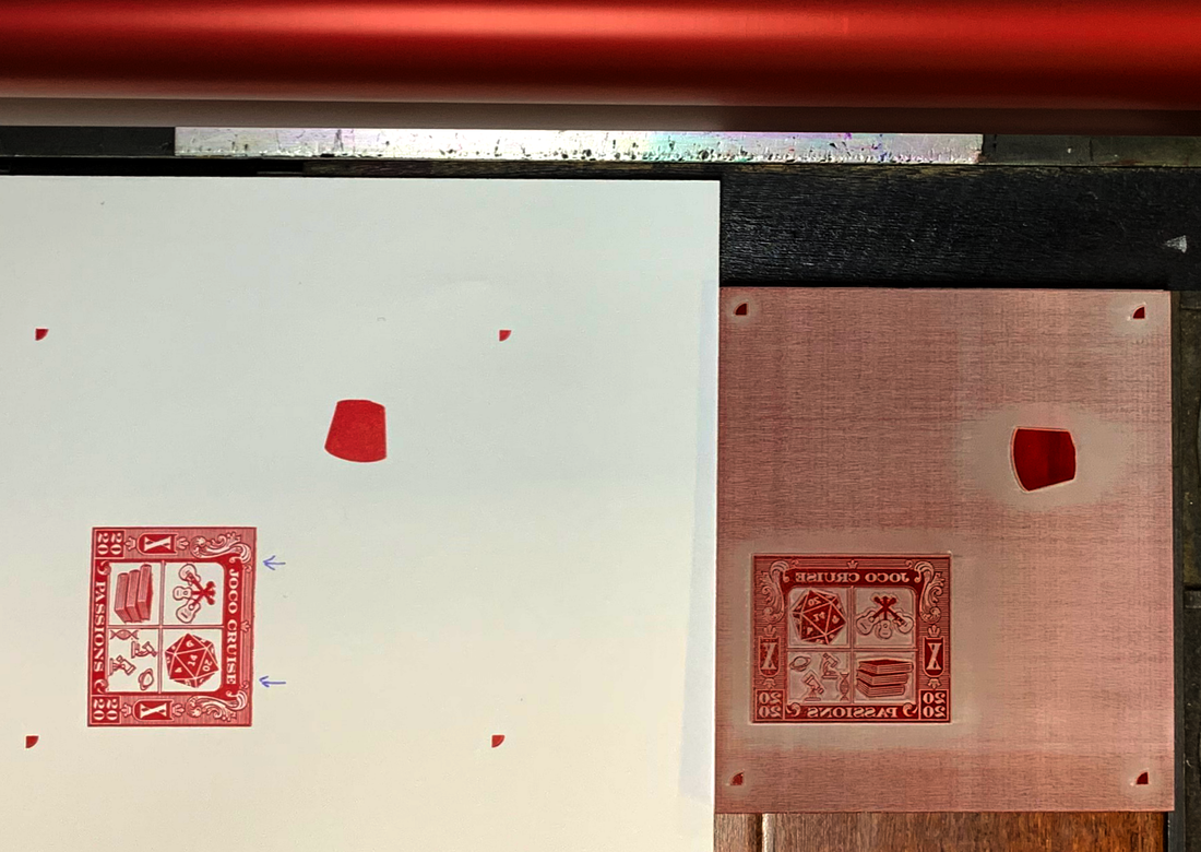
Despite the shallow relief, I was able to pull a rough proof and see the first letterpress versions of the designs.
It would have been helpful if I'd thought to print the black AFTER the gold, but the results are good for a first go. One thing was clear from this proof: the value of Southern Ink's Warm Red was too light for it to hold its own amongst the other colors in the design. It turned out not to be a big deal to mix a better red. I used Pantone 186. Mixing by weight worked fine as long as the total weight was high enough that the weight of the black wasn't too small to measure on my little digital scale. |
|
From this point on, I worked with the plates for each color individually.
The registration mark frames started on the black plate but since black had to be printed after the red and gold for the Formal Night design to come out right, I moved the frames to the blue plate. |
|
|
The trouble with ink on the plate backgrounds persisted, but it didn't always print.
Note the annotations on the proof showing some defect in the plate that needed attention. |
|
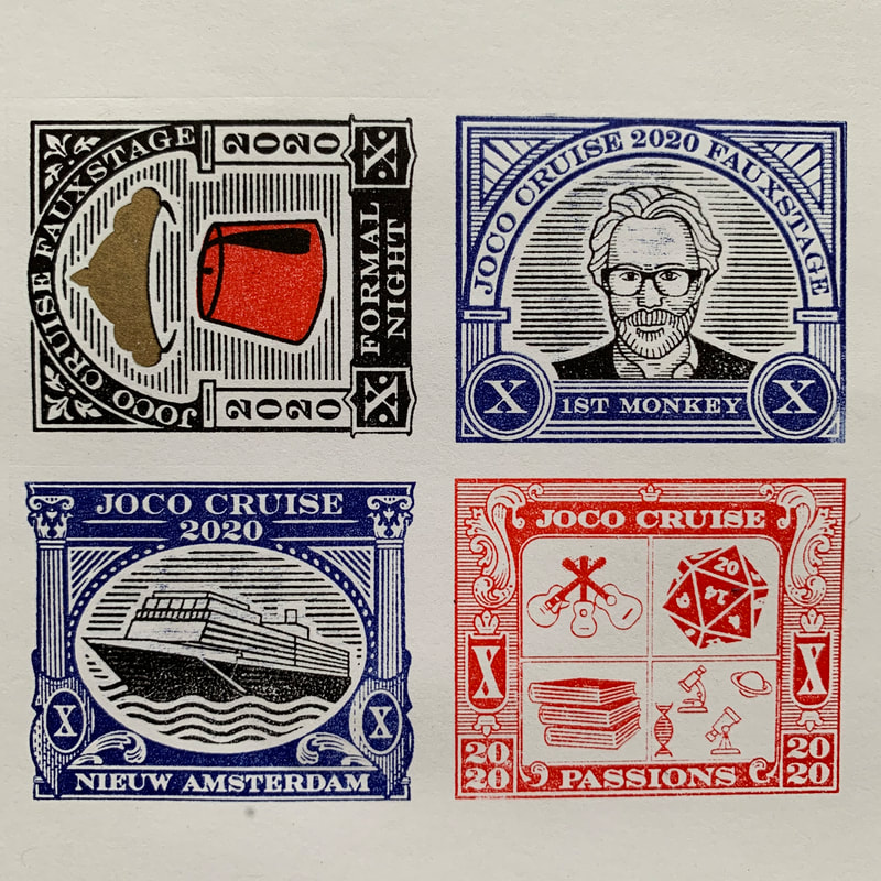
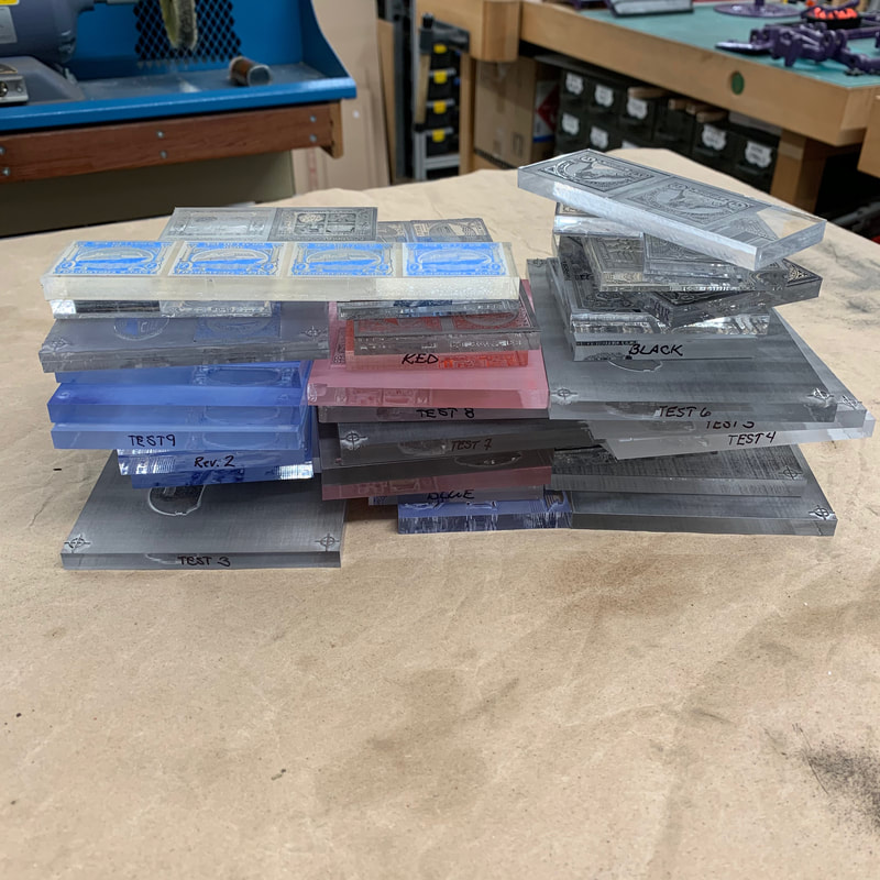
In the end, I achieved an acceptable result. These are most of the plates it took me to get there.
|
|

|
These four plates were used during the stamp press runs.
Getting to these four little slabs o' plastic was by far the most work of the entire project. Actually printing and assembling the booklets was a cake walk by comparison. Rather than stuff this page with all the gory details of the process I ended up with, I've put the minutiae on a page of their own. |
I was closing in on being ready to print, so I had to decide what kind of paper to print on.
