As in previous years, the single imperative for the 2024 Passporto project was quality.
All aspects of the game had to be designed and made to the best of our abilities using the best tools, processes, and materials we could practically get our hands on. This approach increased the complexity, effort, and cost of various parts of the project but that's okay. In the end, we were doing the project to enjoy the making and to create something that we were happy to put our names on. Then we could give it to our friends to have fun with.
|
Before diving into the design, a few words about tools.
Unless described otherwise, all of the design work for this project was done using Adobe Illustrator. After finally making peace with the pen tool a couple of years back, Illustrator has become the primary tool for the print/graphic design work that happens around Wicked Bear Press. |
|
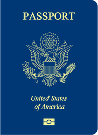
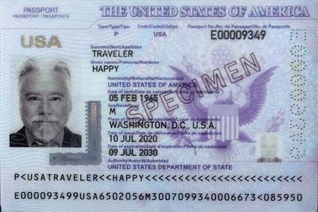
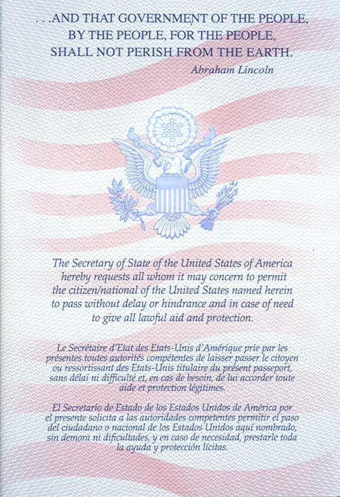
So, where to start with the design? With real passports, of course!
|
Overall Design
For the overall design we adopted a few features from the real world:
|
|
|
The typeface used for the cover is Dead Revolution by Chequered Ink. This is a carry over from its use of on many JoCo Cruise-related fauxstage stamps. The boat graphic is modified from an older JoCo Cruise graphic called the "Hero Boat." No idea why it's called that, but it's a great abstraction of a cruise ship. Perfect for hot foil stamping and other kinds of letterpress printing. Why red? Two reasons. One, because we didn't want there to be anything about the Passportos that might lead people to confuse them with a real passport. Two, in 2022 the first Passportos were printed on dark red Plike paper that was a gift from the amazing Jessica Spring of Springtide Press in Tacoma, WA. Once we got started with red, it sort of stuck. More about hot foil stamping later. |

|
|
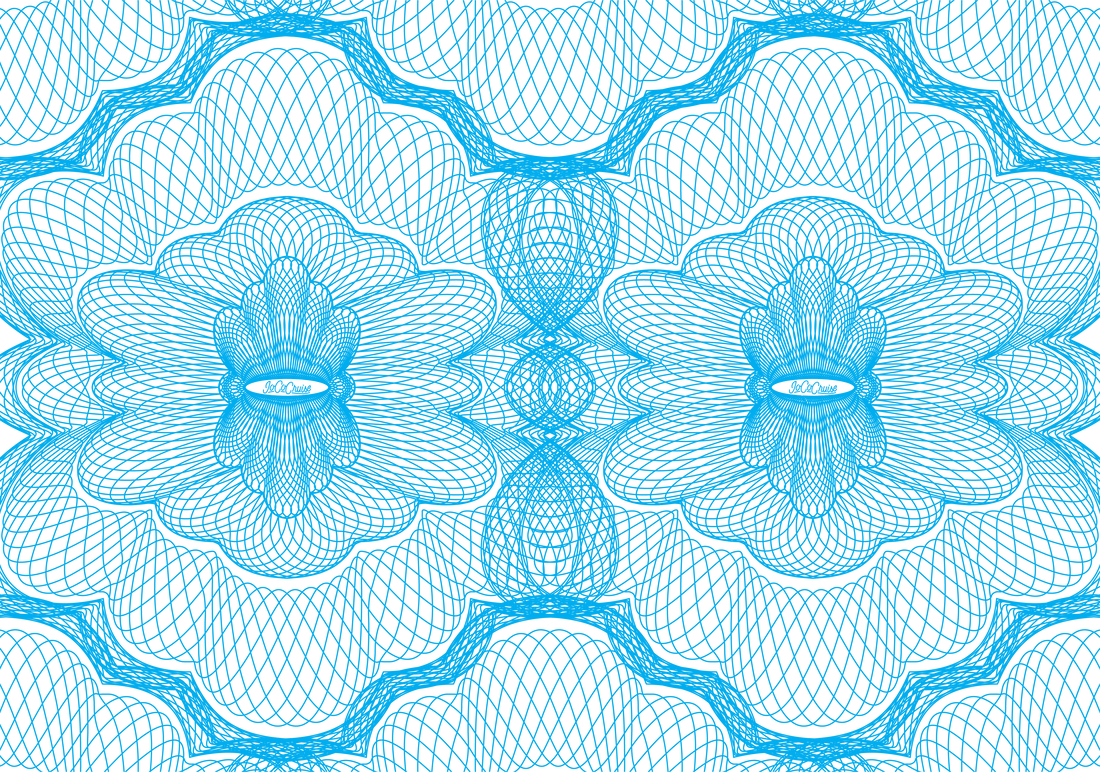
Interior Pages
Inside the Passporto, we continued the gentle parody of the US passport design by starting with a guilloché security background pattern. Guilloché is sometimes called engine turning. The designs of engraved stamps, bank notes, stock certificates, etc. from the 19th and early 20th centuries are amazing. Many of them feature these complex patterns to deter counterfeiting. Think Spirograph, only much, much more detailed. So, of course, we needed a proper JoCo Cruise pattern. |
|
|
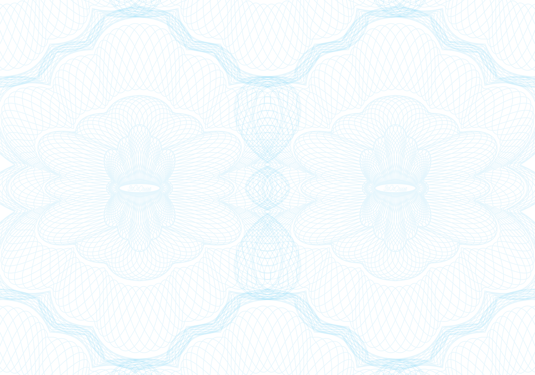
The blue color was chosen based on some of the JoCo Cruise logo artwork from 2022. It was good match for the paper we wanted to use for the interior pages, but it was way too dark.
Dropping the opacity down to 10% yielded a faint but discernible pattern over which we could print the rest of the page elements. |
|
|
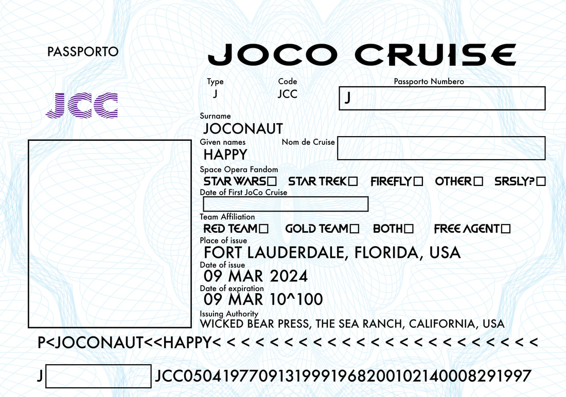
Photo Page
More Dead Revloution along with various other faces to parallel the US passport design. This design is largely unchanged since the first JoCo Passporto game in 2022. |
|
|
|
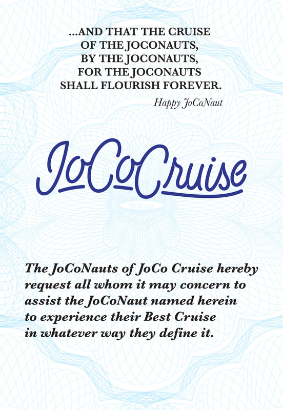
Title Page
JoCo Cruise changed their logo before the 2024 cruise, but we stayed with the previous logo. It seemed to fit the overall esthetics of the passport design and avoided stepping on the toes of any JoCo Cruise IP. This design is largely unchanged since the first JoCo Passporto game in 2022. |
|
|
|
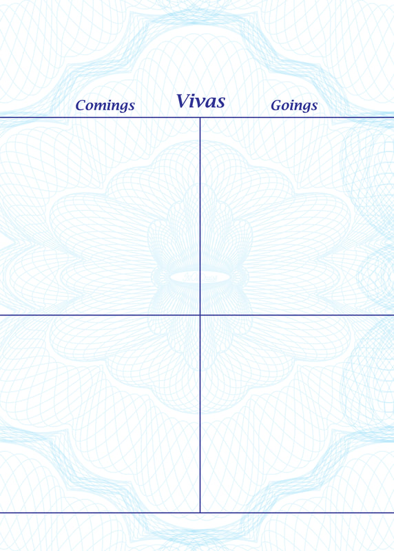
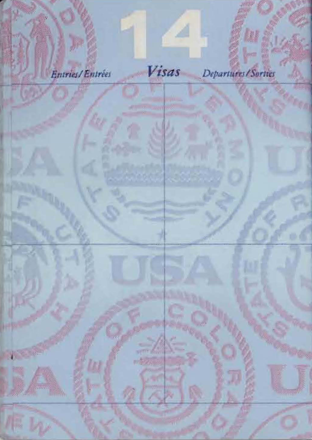
Visa Pages
These US passport pages are not awesome. They're too busy and obscure the visa stamps applied to them. The cleaner look of the Passporto design should show all kinds of stamps clearly. This design is largely unchanged since the first JoCo Passporto game in 2022. |
|
|
|
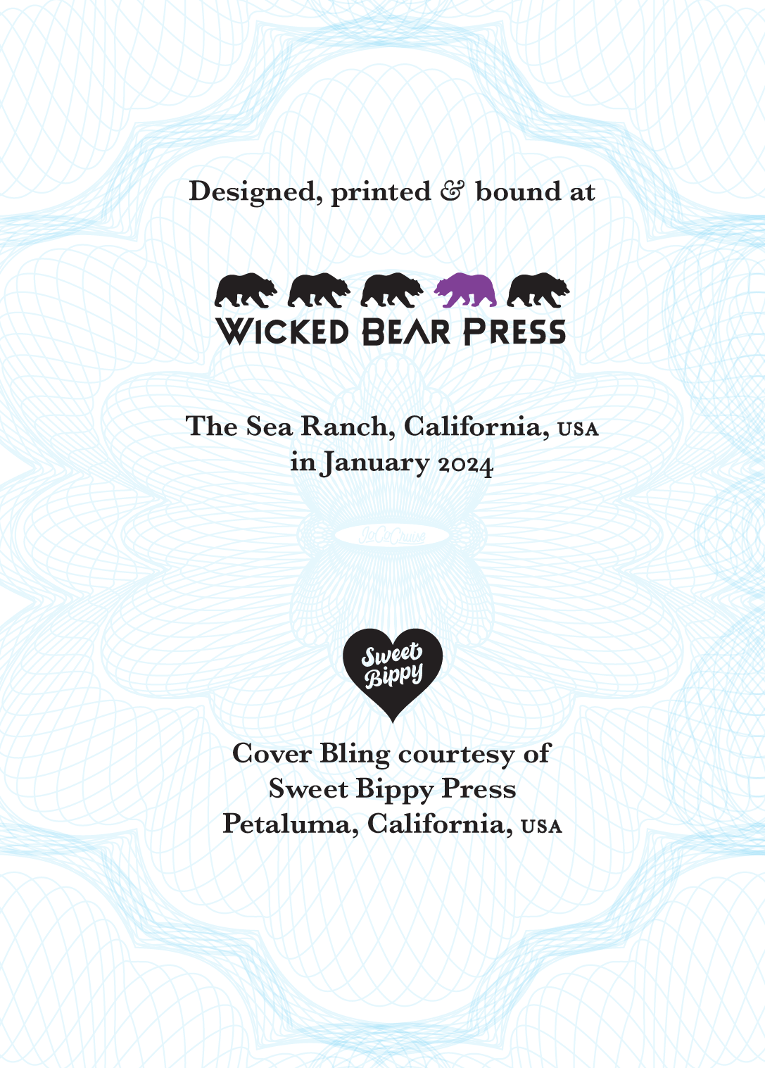
Colophon
The last design task was a colophon. Pretty simple, but it provided an opportunity to let people know where the Passportos came from. It also allowed us to make sure everyone knew about the invaluable help we got on the project from our friend Michael Rylander at Sweet Bippy Press. Lots more about that coming up. The colophon has been different in each year's Passporto design. |
|
With the design pretty well set, it was time to figure out how to print the Passportos. To do that we need to choose some materials.
