|
Sheet of Stamps (aka Local Post, Cinderellas, Poster Stamps, Fauxstage) Gummed paper Southern Inks: L.P Dense Black, Custom indigo mix Letterpress printed, mechanically perforated 6 1/2" x 4 1/2" (165mm x 114mm) |

|
|
These stamps were made during a Partners In Print workshop with Jessica Spring of Springtide Press.
The workshop focused on small scale and perhaps daredevil typesetting for fauxstage stamps. |
|

|
The workshop had 12 participants, and each created a sheet of fauxstage stamps using sheets pre-perforated by Jessica. Everyone presented their work during the second on-line session and then sent sheets to Jessica for inclusion in sets that were distributed to all participants.
This is the second time I've done this workshop, and the first one was a blast.
This is the second time I've done this workshop, and the first one was a blast.

|
Participants were offered a choice of two pre-perforated sheet layouts: 8 identical stamps or 5 stamps with two sizes.
I chose to perforate my own sheets because I wanted stopped perfs (perfs that don't go to the edge of the sheet) all around the stamps. More about that below. |

|
|
Project Goals
|

|

|

|
Since I wanted to hand set a bunch of type using the new round rings, I thought some round cuts would be a good design element. I immediately thought of my favorite round designs: Mon, or Japanese family crests.
Mon from Wikipedia |
|
My favorite reference book about Japanese heraldry
The Elements of Japanese Design John W. Dower New York, Walker/Weatherhill 1971 ISBN 0802724477 This hardcover first edition is still available but a bit pricey. There is a later paperback edition (ISBN 0834802295) that is more affordable. I started the design work for the project by going through this book and identifying designs I liked. |

|

A scan of a typical page of mon illustrations from Dower's book.
|
After I selected the mon, I scanned the appropriate pages from the Dower book.
Then I redrew the designs as vector art using Adobe Illustrator. With these designs in hand, I could lay out a digital mock-up of the project, again in Adobe Illustrator.
|

|
For this project, once again I turn to my friends at O-SNAP (The Ornamentanian Society of Naively Adventurous Printers) in Ornamentania. This time O-SNAP is collaborating with the Ornamentanian Museum of Art and Illustration, colloquially known as O-MAI.
As before, the currency of Ornamentania is the Point, abbreviated to PT$ This image is the final digital mock-up of the project created in Adobe Illustrator before I started making cuts and setting type. The same art was used to make the cuts for the mon designs. Any bets on how close the final layout will be to this mock-up? How many of these souvenir sheets do I have to make before it should officially be considered being stuck in a (creative) rut? Maybe I don't care, because I think they're cool? |

|
     |
First task was the create the cuts
A couple of years ago, I developed a process to use my CO2 laser engraver to make cuts by engraving 3/8" cast acrylic sheet. The process is pretty fussy and is described in great detail here and here. I hoped to simplify the process if possible by experimenting with different combinations of artwork and engraving conditions. The first proofs of the simplified process were promising but revealed that a few tweaks were required. |
|
Turns out the digital font I used for the layout was much narrower than the actual Engravers Bold type in the printshop.
Using the type we actually have required significant changes to the layout. Also, the 6pt Engravers Bold is the No. 2 size, the second smallest character on a 6pt body. So, all the 6pt text will be a lot smaller than is shown in the layout. Adding 2pts of letterspacing to the circular text helped gave the text a little more presence in the layout. I need to find some 6pt No. 3 and 6pt No. 4 Engravers Bold. |

|
       |
Each stamp is 10 pica x 9 pica.
The stamp text form was designed to make it as easy as possible to swap the text in and out for each stamp. The actual arrangement of spacing for the stamp text form was a fair bit messier than the idealized version shown in the layout below. 
|
|
I used two types of stock for the project:
|
|
|
|
The indigo blue cuts were printed first with ink mixed from a recipe half way between Pantone 2935 and 2945. Southern Ink Process Blue, Reflex Blue, and Mixing Black at ratios of 61.6%/36.9%/1.5%, respectively.
Type for the sheet text and first stamp text were combined into one form for the first black run. All black runs were done with Southern Ink Letterpress Dense Black. I didn't discover the typo in "souvenir" until after the first black run was complete. So I decided that's the way souvenier is spelled in Ornamentania. I guess the Ornamentanians got tired of the British being the only people to have extra vowels. Next, the sheet text was removed and the stamp text form moved over to the next position in line (after swapping the appropriate text into the ring form). Rinse and repeat 6 more times. Getting the ring text properly aligned to the sheet and around the circle took some fiddling but wasn't too difficult. Adding the two small star ornaments at the 3 o'clock and 9 o'clock positions helped keep things oriented. Marking the rings at 12, 3, 6, and 9 o'clock also helped. |


|
The finished sheet, before perforating.
Each run of black stamp text took about 30 minutes of actual press time after some time getting things lined up. Despite having all the furniture marked and insuring it remained in the same place for each run, a bit of adjustment (1pt or less) was required to center the cut inside the text. |

|

|
The first step in perforating is figuring out where the perfs go. Sometimes a lot of trial and error is required to figure out the locations.
The numbers on the sheet are the length in mm from the row of pins to the trailing edge of the sheet for a given row of perfs. The closer the row of perf is to the leading edge of the sheet, the further away the trailing edge is from the pins. Once I have the coordinates, perforating is a simple matter of inserting the sheet under the pins with the trailing edge at the specified number on the tape measure that extends away from the pins towards the edge of the perforator table. |

|
One complication for this project is that I didn't want the perforations to run to the edges of the sheet. Instead, I wanted them to frame the block of 8 stamps within a solid border all the way around. I called this type of perforation "stopped perfs" because I had call it something.
Awhile ago, I made some accessories for my Rosback pin perforator so I could make rows of stopped perfs pretty much any length I wanted. I called the accessories "activator bars" because I had to call them something. There is more information about using the activator bars to make rows of stopped perforations here. |
|
The finished project.
Some takeaways from the project:
|
|

|
During the first class session, Jessica suggested that we might want to make First (Fauxst?) Day Covers for our stamps. So I did.
Same basic approach as the stamps themselves: digital layout in Adobe Illustrator, printed from laser engraved acrylic cuts. Since a FDC wouldn't be complete without an appropriate postmark (Fauxstmark?), I made one of those on the laser, too. The die line shown at left is for a #6 1/4 size commercial envelope. I chose it because it will (barely) fit on an 8 1/2" x 11" sheet when skewed just right. I printed on larger sheets (of 80# text Mohawk Superfine, ultrawhite, vellum) so I didn't need to hassle with constructing and locating a skewed form. I cut the envelopes out of the parent sheet with the laser. |
|
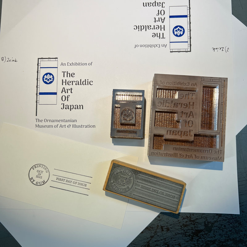
First proofs of the FDC cachet came out remarkably well.
The registration looks spot on, thanks to the laser creating a precise cut and the Hammond saw creating a precise base. I stuck the cuts to the base using Boxcar Press polymer plate film adhesive. To register the blue cut with the black cut, all that was needed was a common reference corner (here, the upper right). I printed the black cut and then simply swapped in the blue cut without moving any of the furniture above or to the right of the cut. The fauxstmark rubber stamp came out fine since I've made a lot of them in the past. |
|

|
Die cutting with the laser was slow as expected, but it did the job.
The slow speed of the laser is a good trade off for its flexibility. I noticed (after cutting a few out) that I hadn't left enough overlap on the flaps to apply a line of adhesive from a tape runner. No problem, a few minutes in Illustrator and I was cutting a new die line. The picture at left also shows my favorite scoring tool: a stainless steel pallet knife. It makes a crisp, deep score compared to a bone folder. I tried to capture that in the picture below. 
|
|
From there on, it was just
And I only glued one together upside down! |

|

|
This finished Fauxst Day Cover.
I'm amazed at how convincing it came out. |
