|
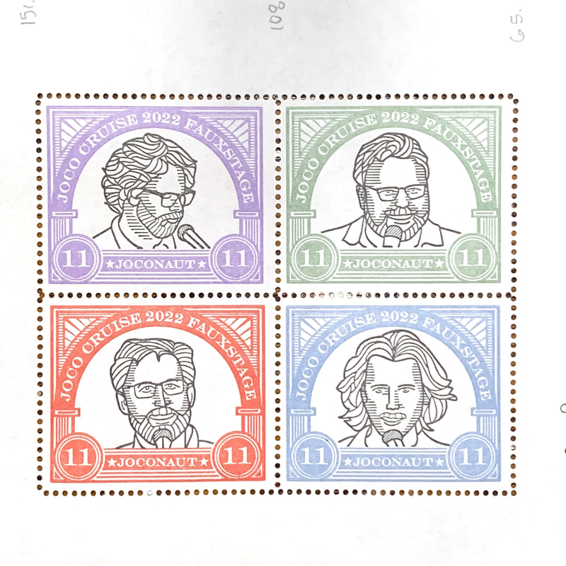
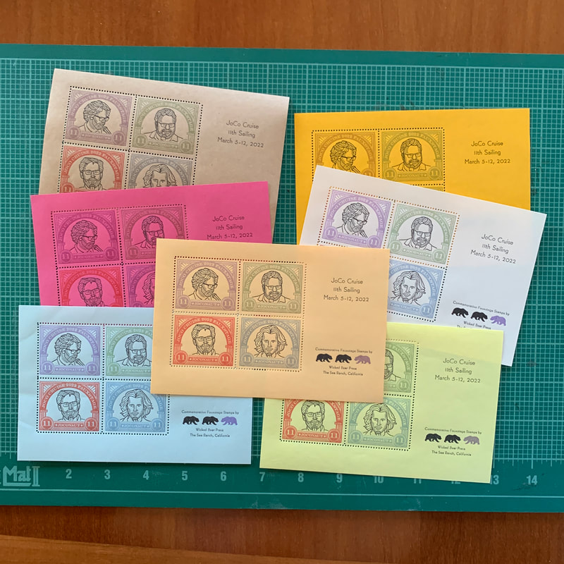
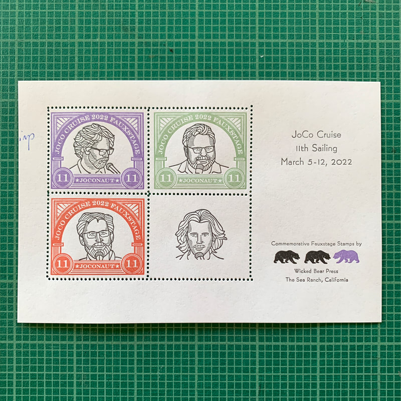
Sheet of Stamps
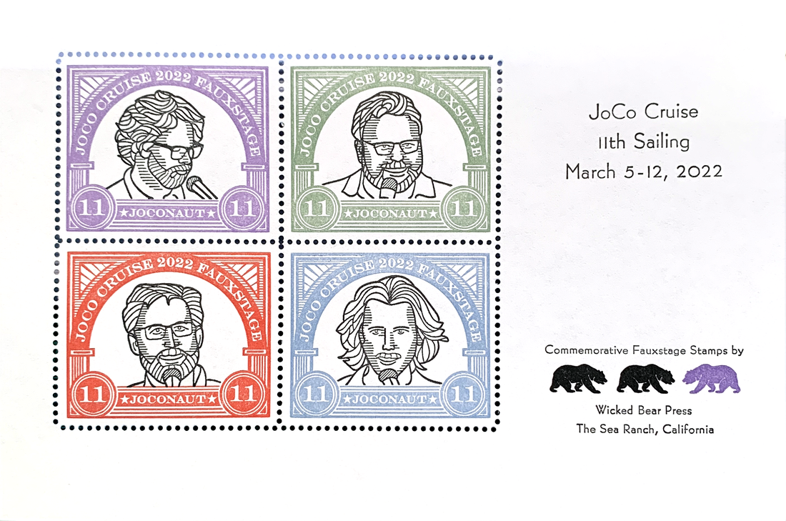
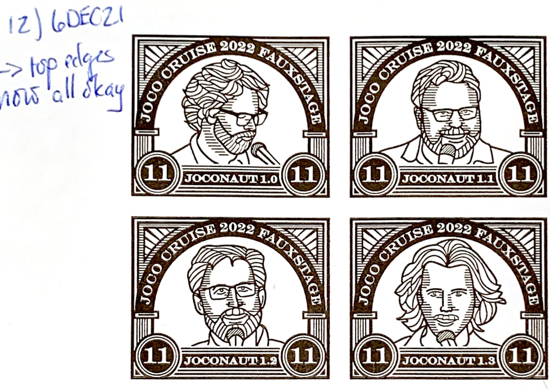
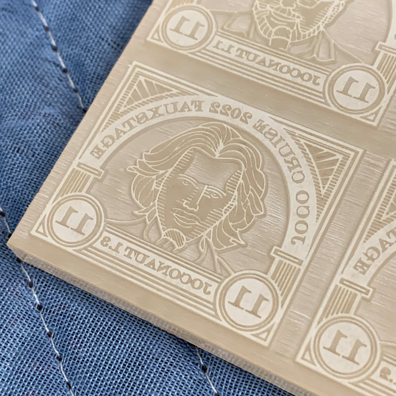
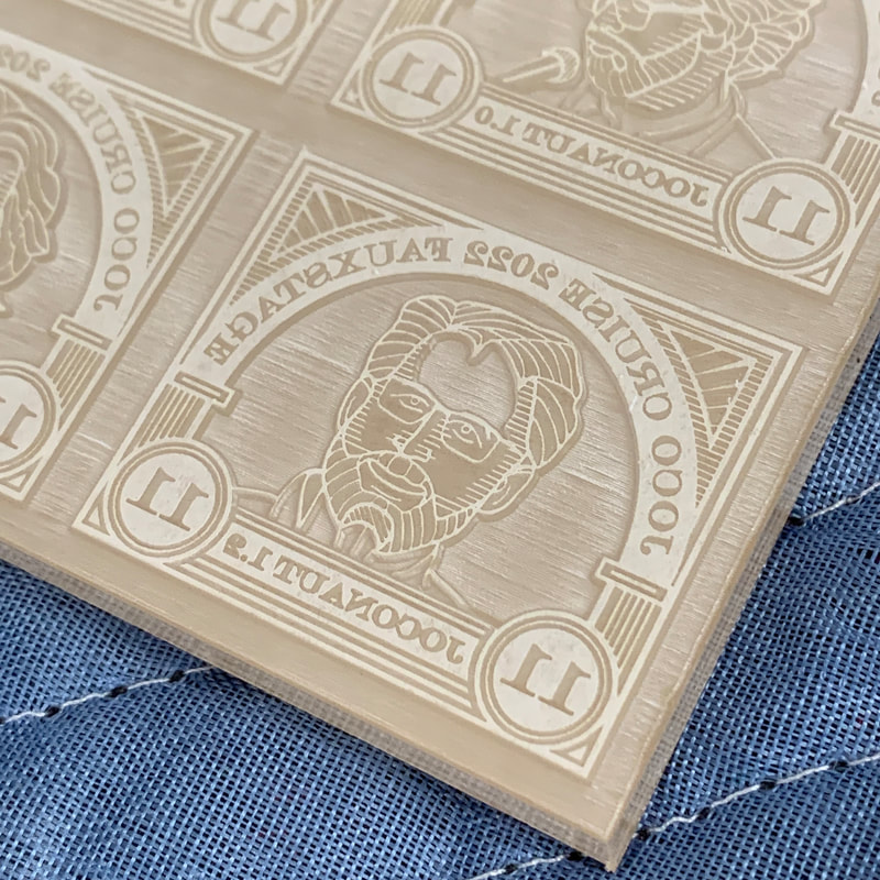
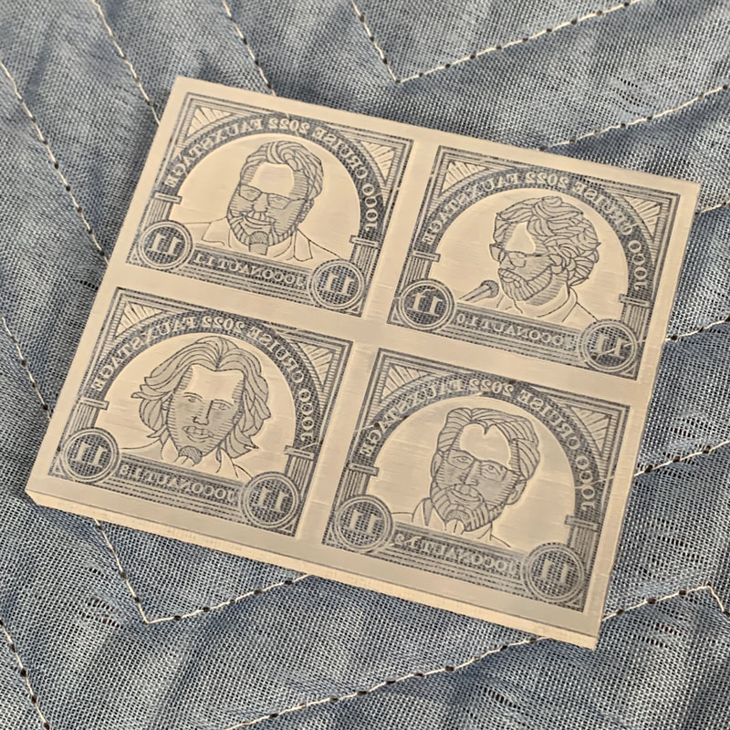
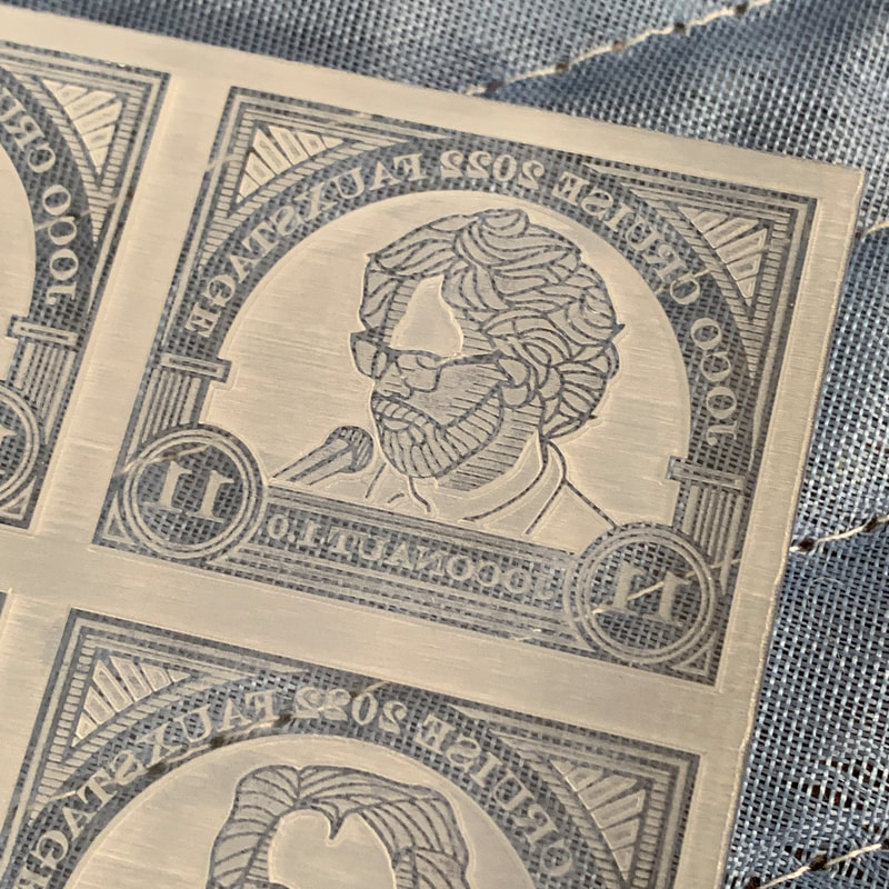
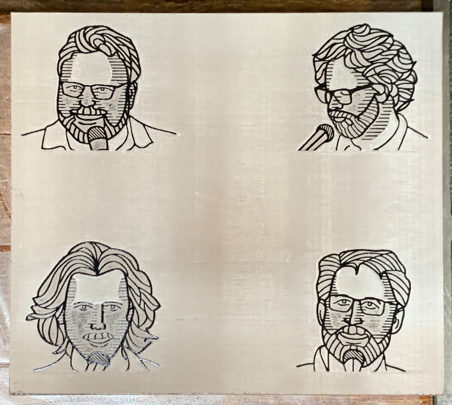
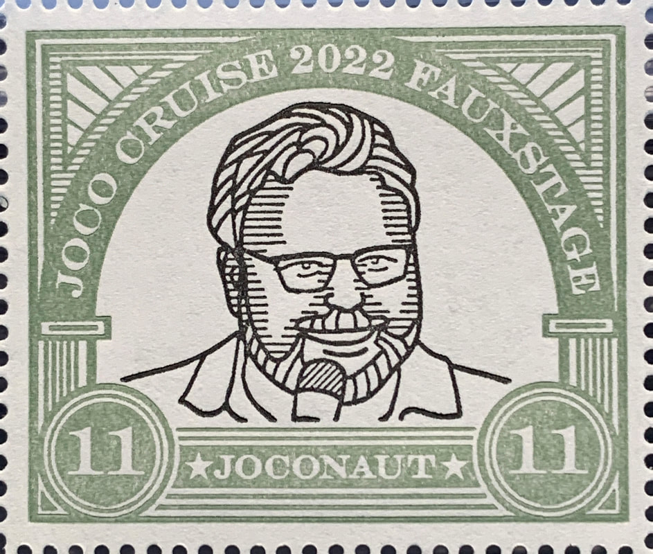
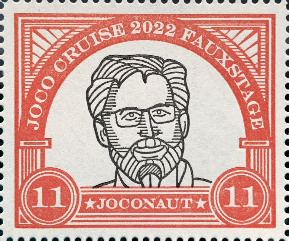
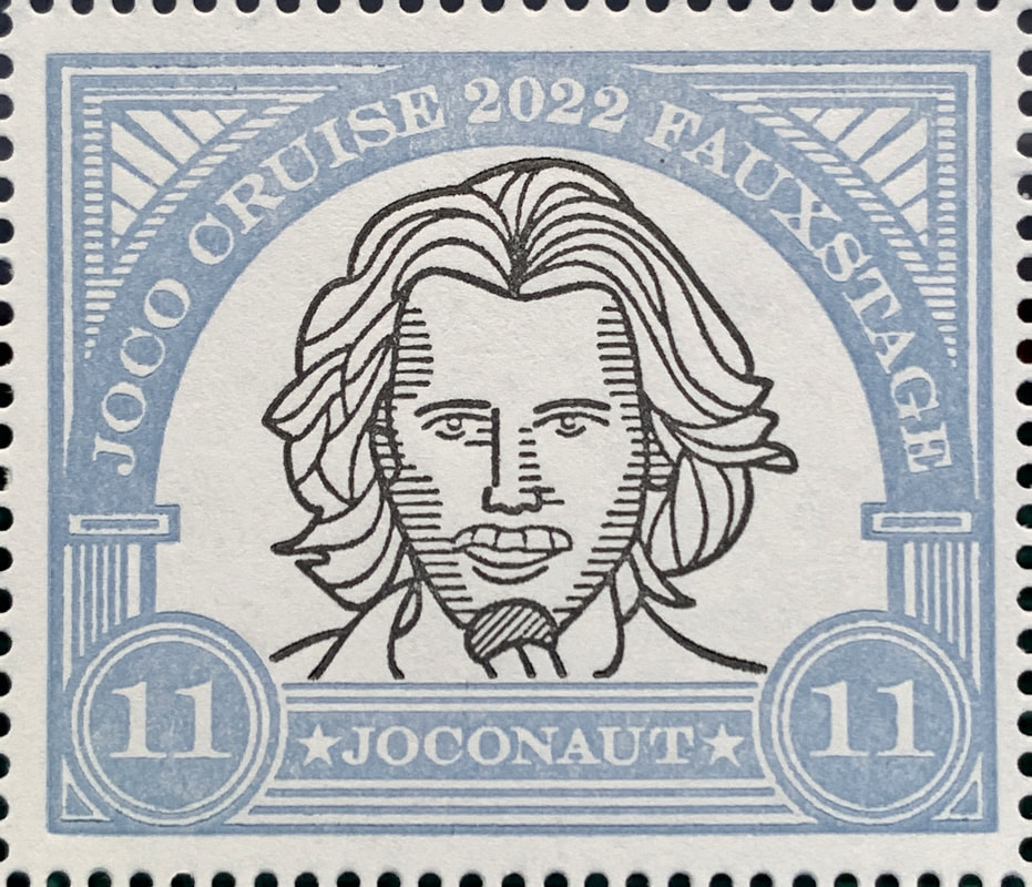
(aka Local Post, Cinderellas, Poster Stamps, Fauxstage) Stylized portraits of partners behind the JoCo Cruise. From the upper left: Jonathan Coulton, Paul Sabourin, Storm Di Costanzo, and Drew Westphal Gummed stamp paper Letterpress printed, mechanically perforated 6" x 4" (152 mm x 102 mm) |
|
|
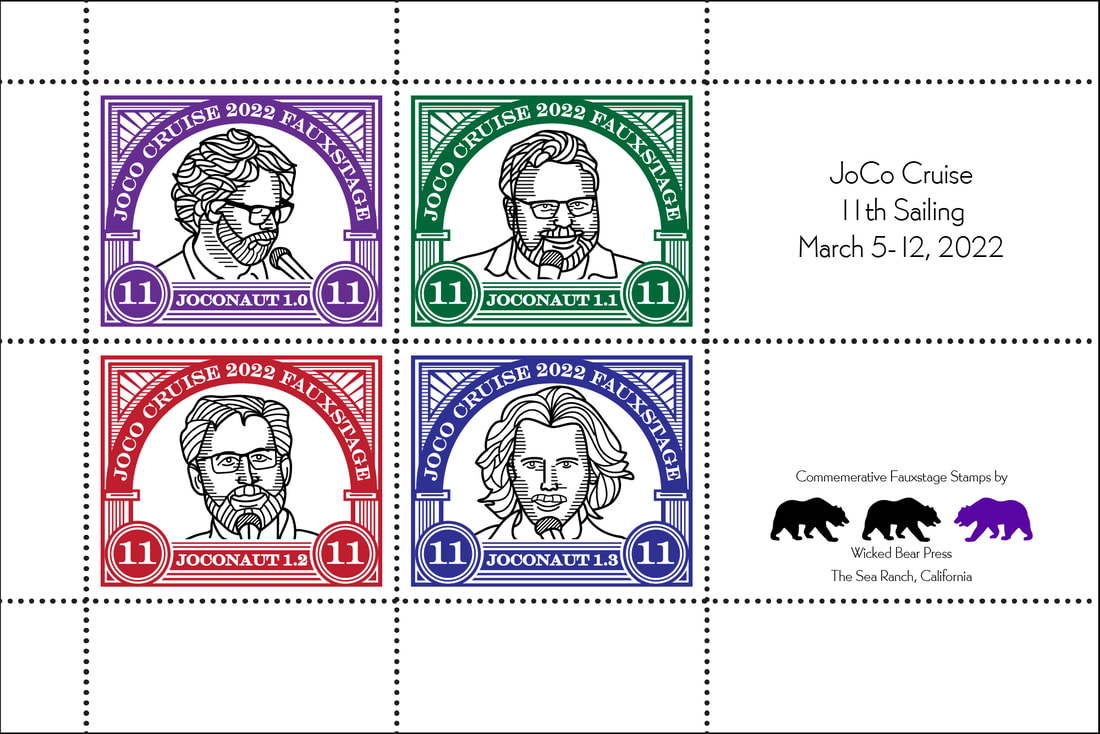
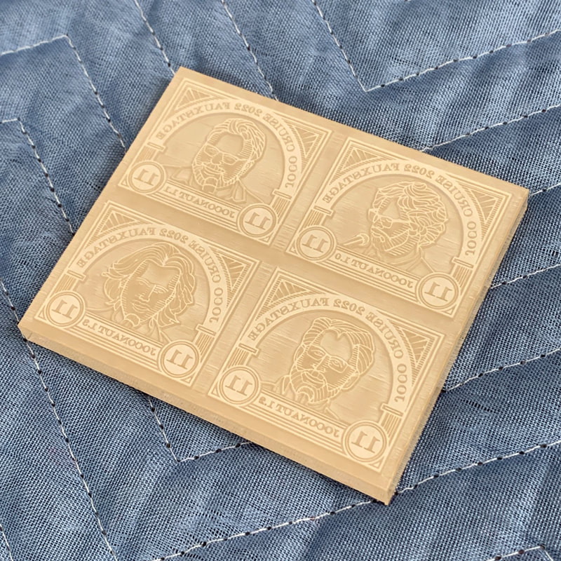
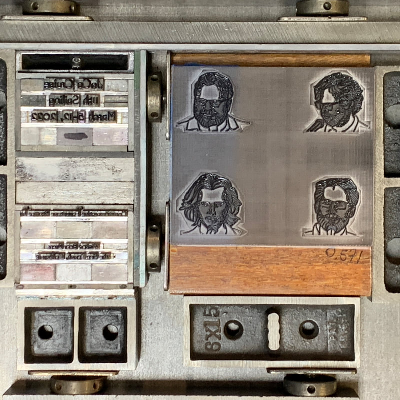
First digital layout used to cut test plates for the stamps. A combination of art drawn in Adobe Illustrator for the project and digitized ornaments from my letterpress ornament layout tool. Text and bears will be handset type. Text is in Bernhard Gothic Light (6 pt and 12 pt). Contour portraits drawn in (a pale imitation of) the style of Peter Voth from photographs taken by Marc Mandelbaum on JoCo Cruise 2020. Many thanks to Marc for permission to use them. |
|
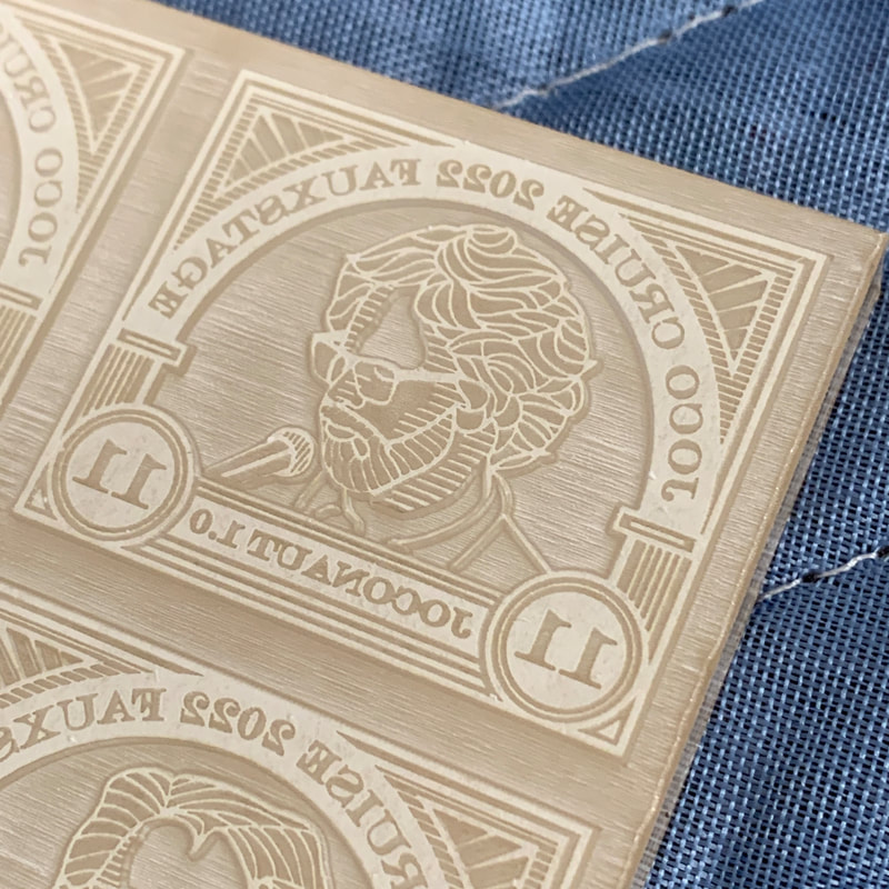
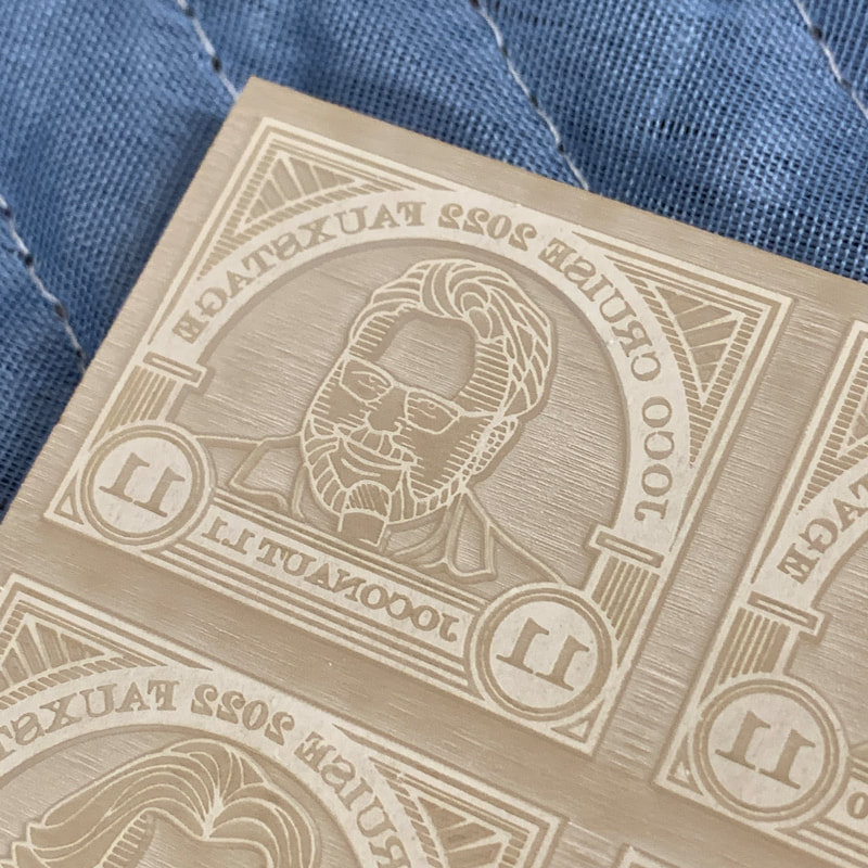
Plate 1 after proofing. Ink in all the background areas due to single pass engraving giving very shallow relief. All engraving done at 90 speed, 60 power, 600 dpi on a 60 Watt Epilog Laser Fusion M2 |
|
|
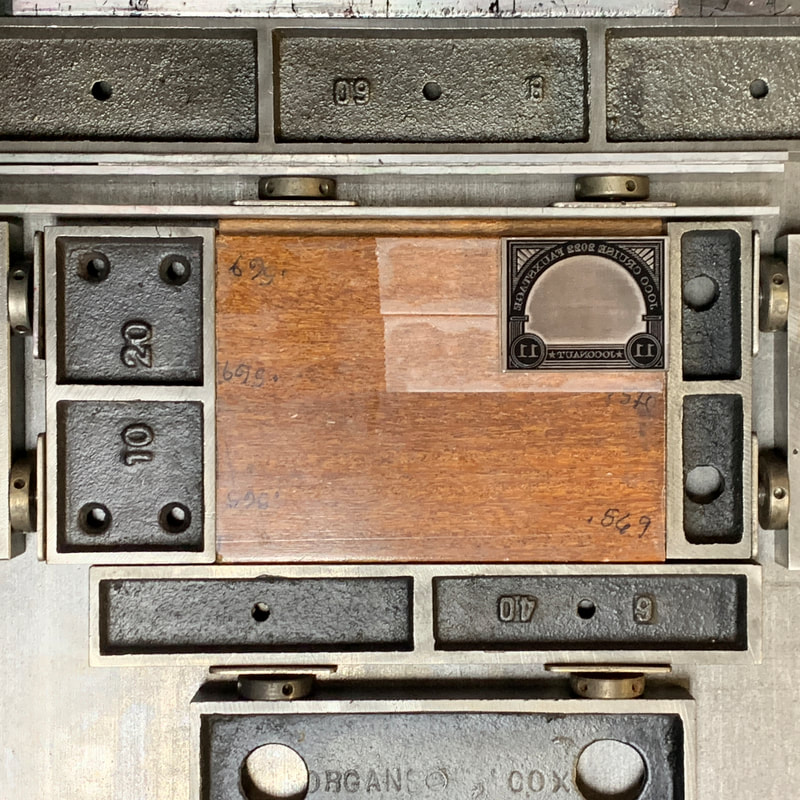
Plate 3 after proofing. Deeper relief so no background inking or printing. Fine line areas of the design still engraved only once. Note all larger open areas within the design were deepened but the smaller areas were not. The paper is well enough supported by the detailed design that it won't print the background. No different from any type or cut with fine detail. Plate is held with double sided tape on a piece of hardwood milled to bring the overall height to just below type high 0.918". Makeready is required anyway because the thickness of the acrylic varies a few thousandths of an inch across even the small area of this plate. This is where the adjustable bed of our Universal I really shines. |
|
|
Proof of Plate 3. Looks good overall but required some cleanup with an Xacto around the outer edges of the frames. Adjust the paths for the 0.25 mm wide "halo" around all deepened areas. This halo removes any debris from adjacent engraving that drifted up against the raised design. |
|
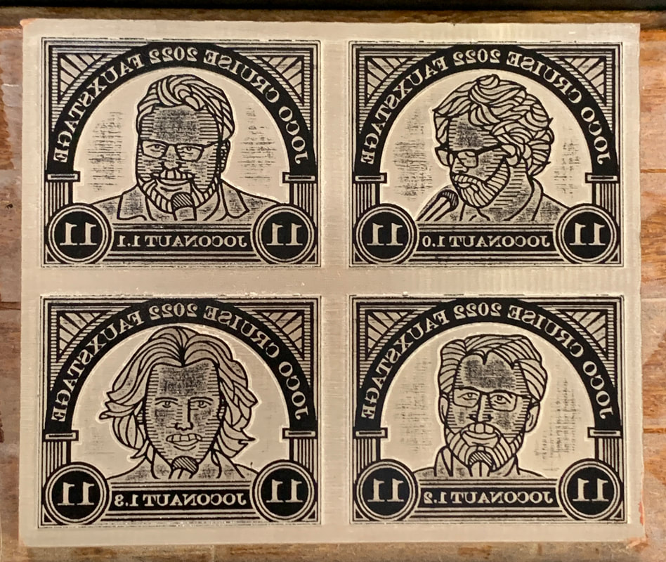
Detailed images of Plate 4. Not proofed since I decided to make the decorative frames all the same. That way for the four different colors only one cut was required. And it will maximize the fun getting all the frames registered to the portraits! First five images show the plate with the masking (top and bottom) intact. Second five images show the plate with the masking removed and after cleaning with soapy water and then isopropyl alcohol. |
|
|
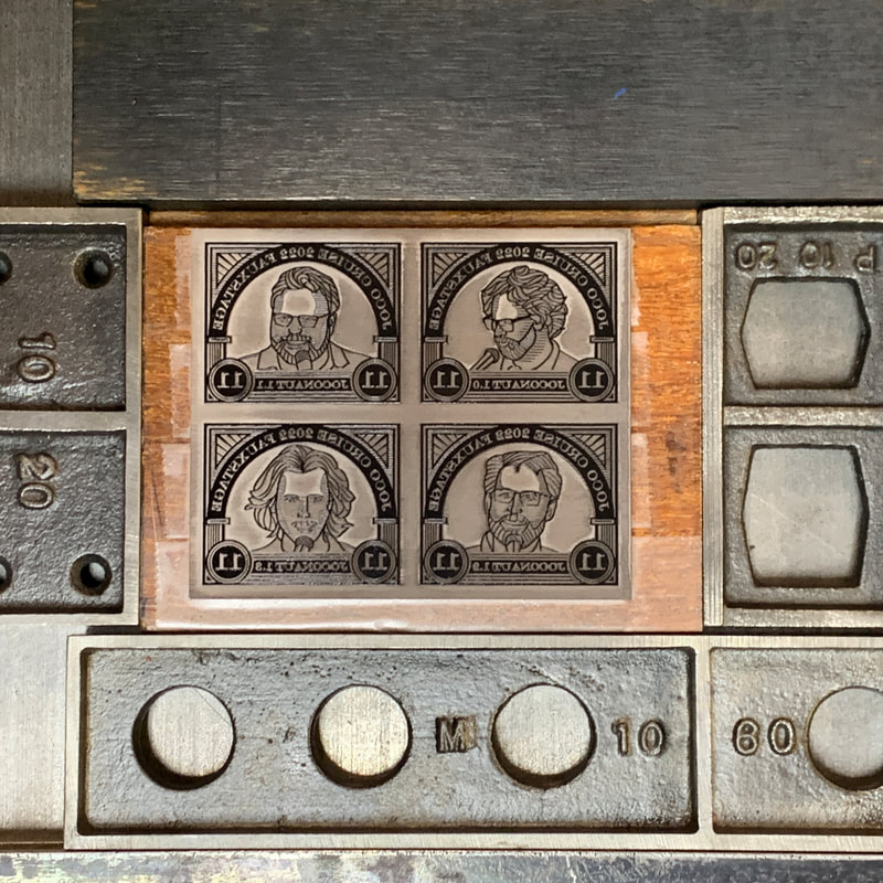
Single frame cut in the press for proofing. |
|
Plate 1 of the portraits only, after proofing Some inking in the recesses of the faces because those regions were missed in the artwork to deepen the engraving. After fixing the art and remaking the plate, looks good to go. |
|
The print runs were remarkably uneventful, so few pictures of them. There were a total of 7 runs:
The double runs of a single colors were done to keep the heavy inking required to print the larger solids (bears) from over inking the finer details of the portrait plate and metal type.
Ink colors were chosen to try to mimic the subdued tones of classic engraved postage stamps. As you can see from the image at the top of the page, that worked okay except for the red coming out a little too saturated. XXXAdd the Pantone #sXXX
- Black portraits and text
- Black bears
- Purple frame
- Red frame
- Green frame
- Blue frame
- Purple bears
The double runs of a single colors were done to keep the heavy inking required to print the larger solids (bears) from over inking the finer details of the portrait plate and metal type.
Ink colors were chosen to try to mimic the subdued tones of classic engraved postage stamps. As you can see from the image at the top of the page, that worked okay except for the red coming out a little too saturated. XXXAdd the Pantone #sXXX
|
Form for the first black run locked up in the Vandercook. Note the Rouse register quoins in place in anticipation of needing to make small adjustments when printing the individual frames. |
|
Plain paper proof after both black runs and the first purple run Note the annotations indicating that the plate for the portraits is slightly askew. |
|
|
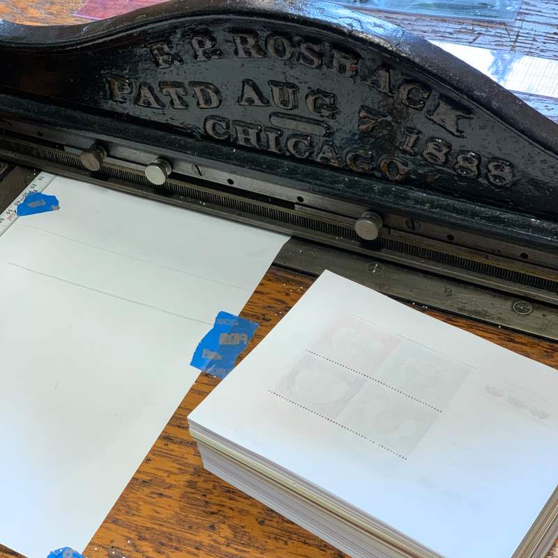
Plain paper proof of the completed sheet used to determine the location of each row of perforations. Since the printing went smoothly, the perforation had to go sideways. I didn't compose the handset type correctly, resulting in the bottom row of perforations running through the bottom row of text. I hit pause on perforating to figure out how to do stopped rows* of perforations on the Rosback. Details of how I did this can be found here. *I don't know if there is a real name for this, but since the perfs stop before they reach the edge of the sheet, I figured this was as good a name as any. |
|
|
Work in progress: perforating on the Rosback |
|
Plain paper proof of the printed and perforated sheet With the flexible bars setting the line lengths, it was straightforward to get the perforations where I wanted them. |
|
|
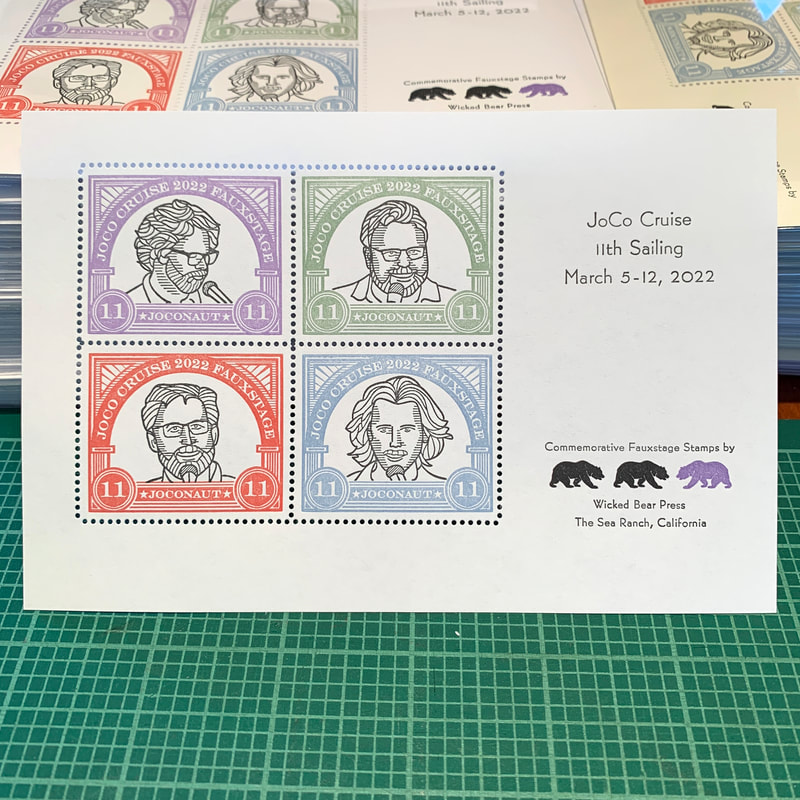
The finished sheet |
|
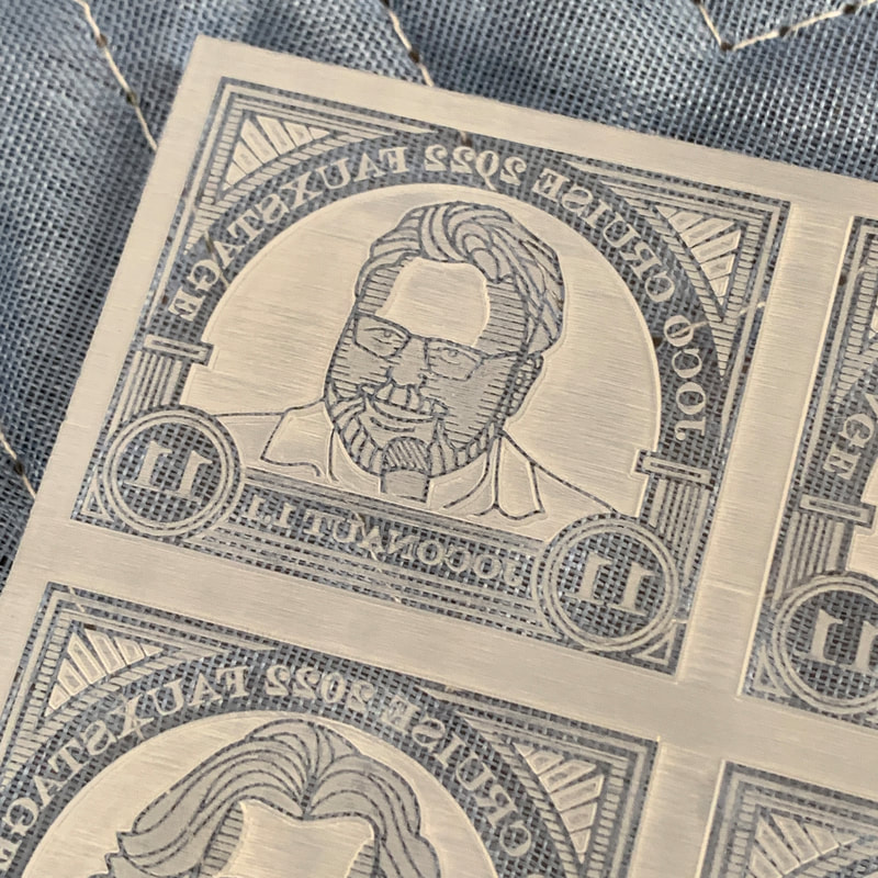
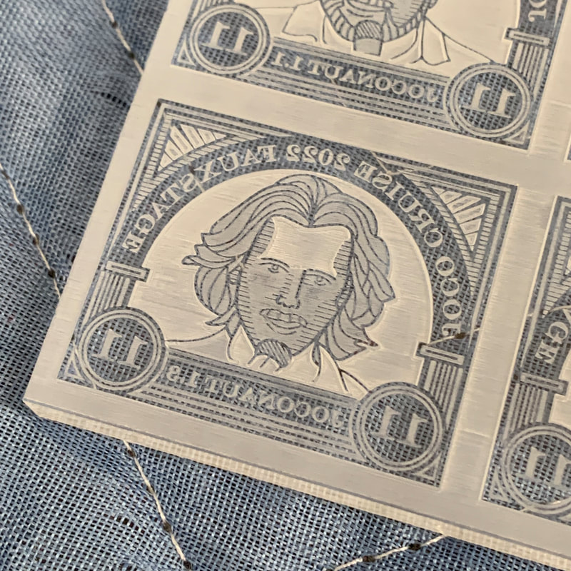
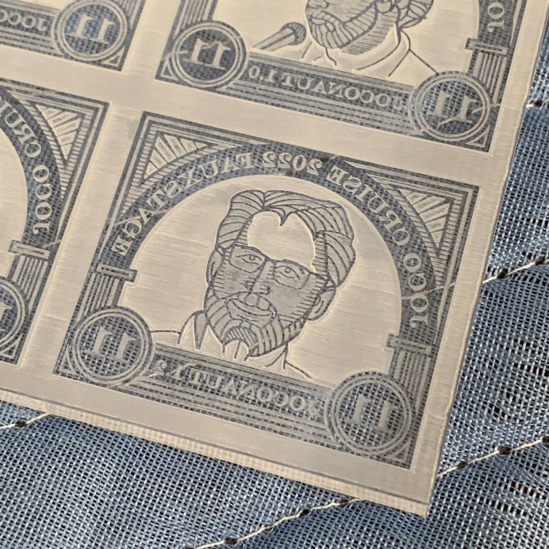
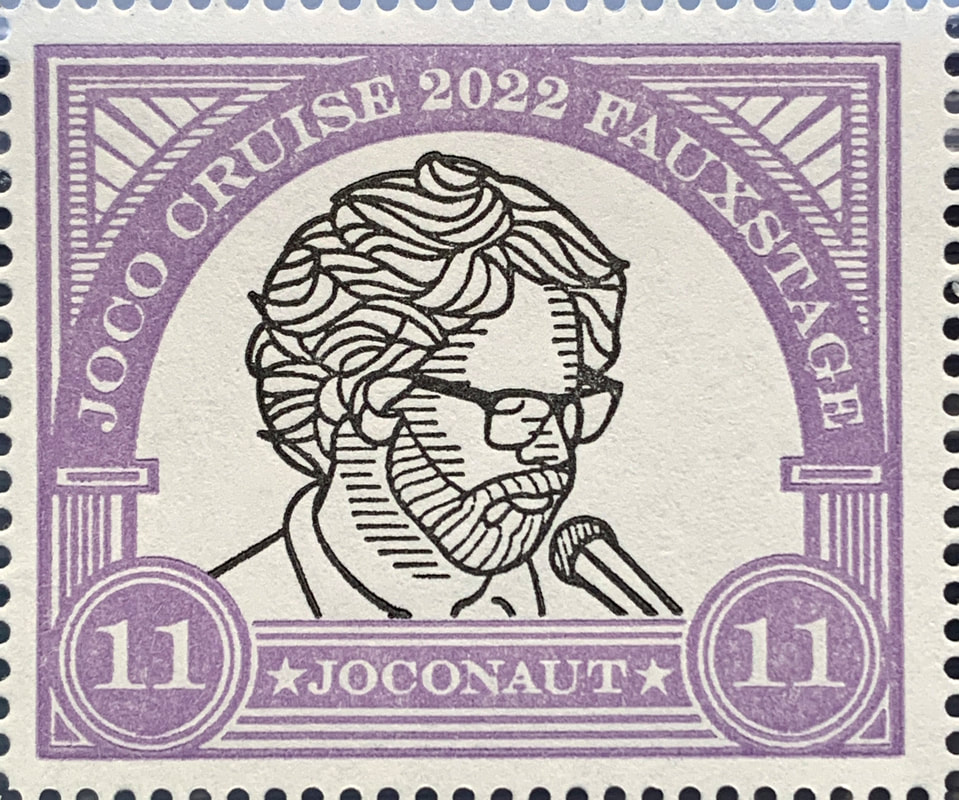
Gallery of close ups of the individual stamps |
    |
|
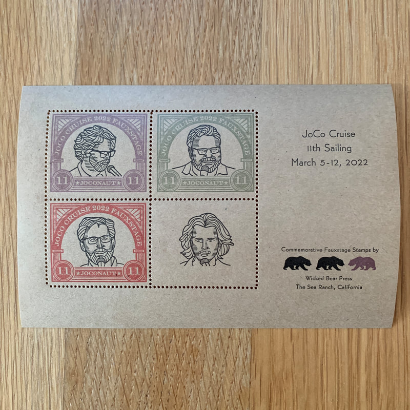
Gummed stock printing tests I printed a few sheets on a variety of gummed stock to see how they would come out. In some cases, the soft colors were dulled by the stock color and in others the colors were shifted. A few even came out nice. |
|
Blooper reel I missed a frame on these proofs. Not sure why both are on the Drew stamp. It's not like I have anything against the guy. |
|
|
